News12 MVP Web and App Experience
Project Overview
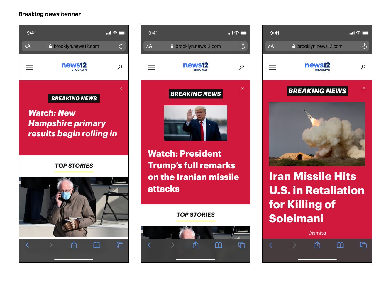
Our main goal was to create a modern digital storytelling experience for News12 users across devices. By creating a more immersive experience, we aimed to attract a new, younger audience to use local broadcast news outlets. Our efforts were to make the News12 sites more up-to-date and ultimately increase retention and engagement.
Team Structure
Main Stakeholder: VP, Digital at Altice USA
Product Team: Director of Product at Cheddar, Product Manager, and myself (Senior Product Designer).
My role: Research, user flows & stories, sketching, wireframing, visual design, prototyping.
Research
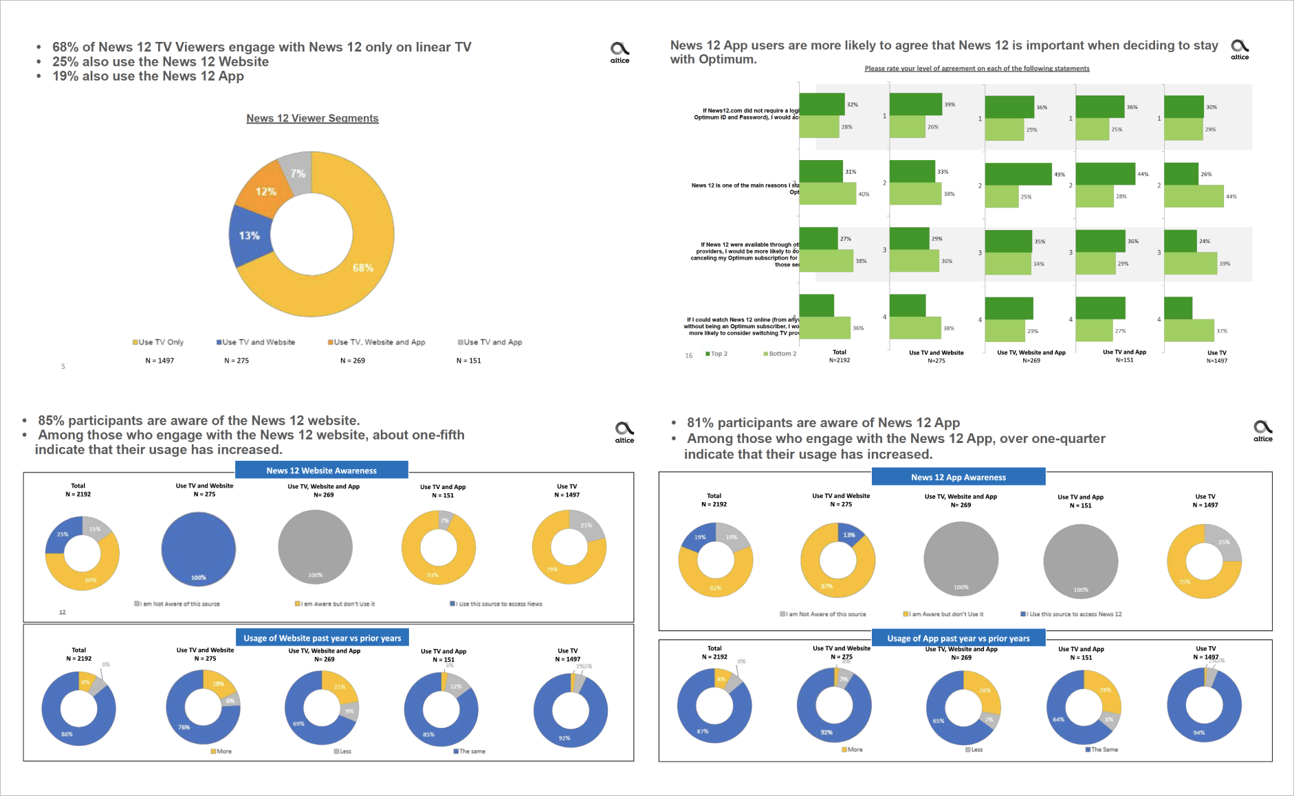
We started the project by sending out an online survey to current News12 users, mainly to understand which platforms they were consuming and why. We learned that 68% of News12 TV viewers engaged with News12 only on linear TV from this initial survey. 25% used the News12 website, and 19% used the News12 app. One of our goals was to attract linear TV "watchers" to our digital platforms.
Both News12.com & App
12% reported that they would be encouraged to go back if the navigation were easier, and another 12% would go back if there were easier access.
News12.com
Of those who have ever been to News12.com, 42% have been to the website in the past week; 23% prefer to get info from local TV channel instead of News12.com; 18% prefer other news websites over News12.com; 18% prefer other websites over News12.com; 4% reported having trouble accessing the site or the content.
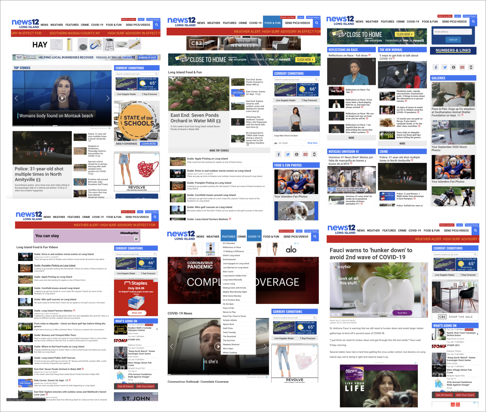
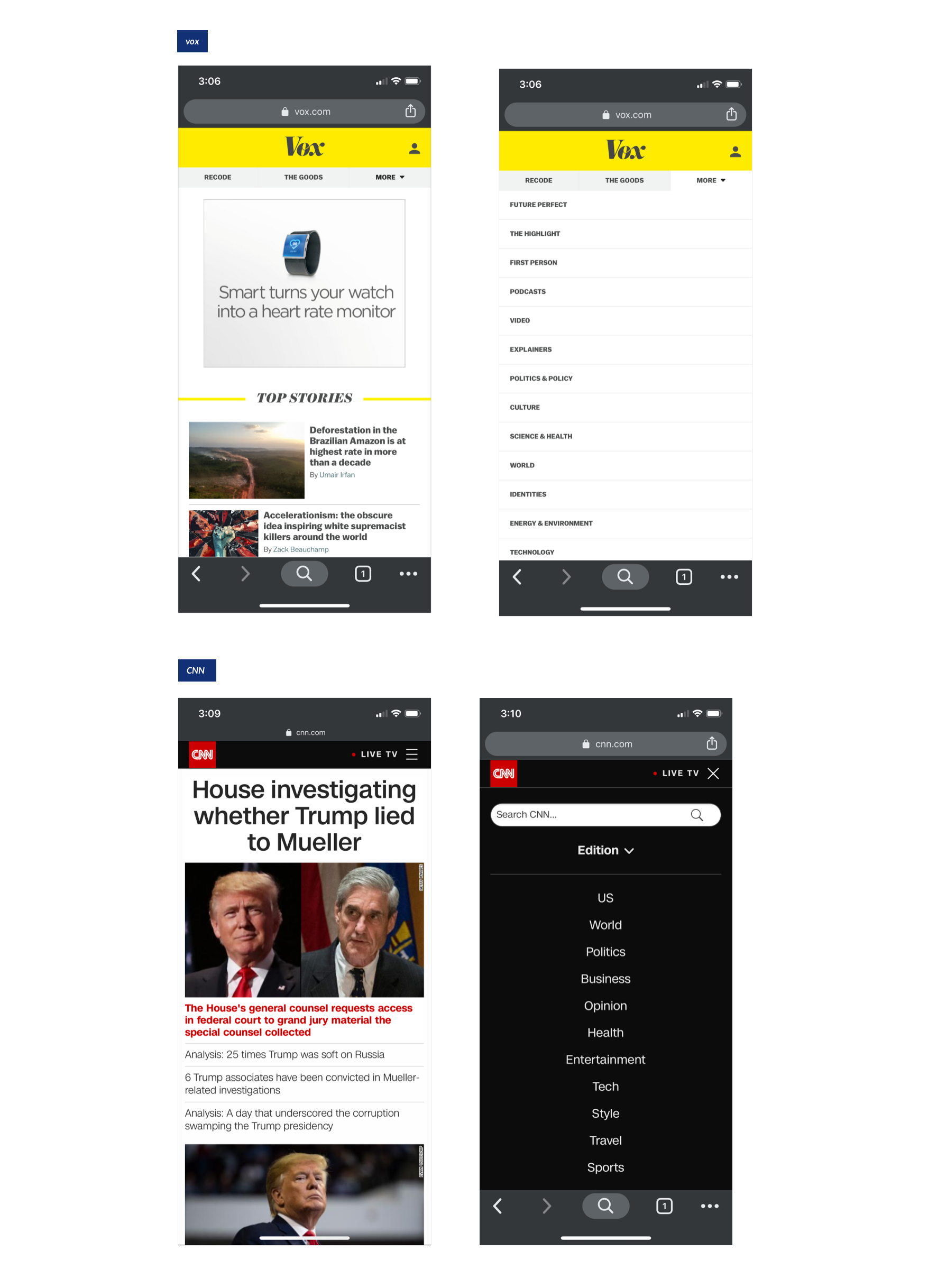
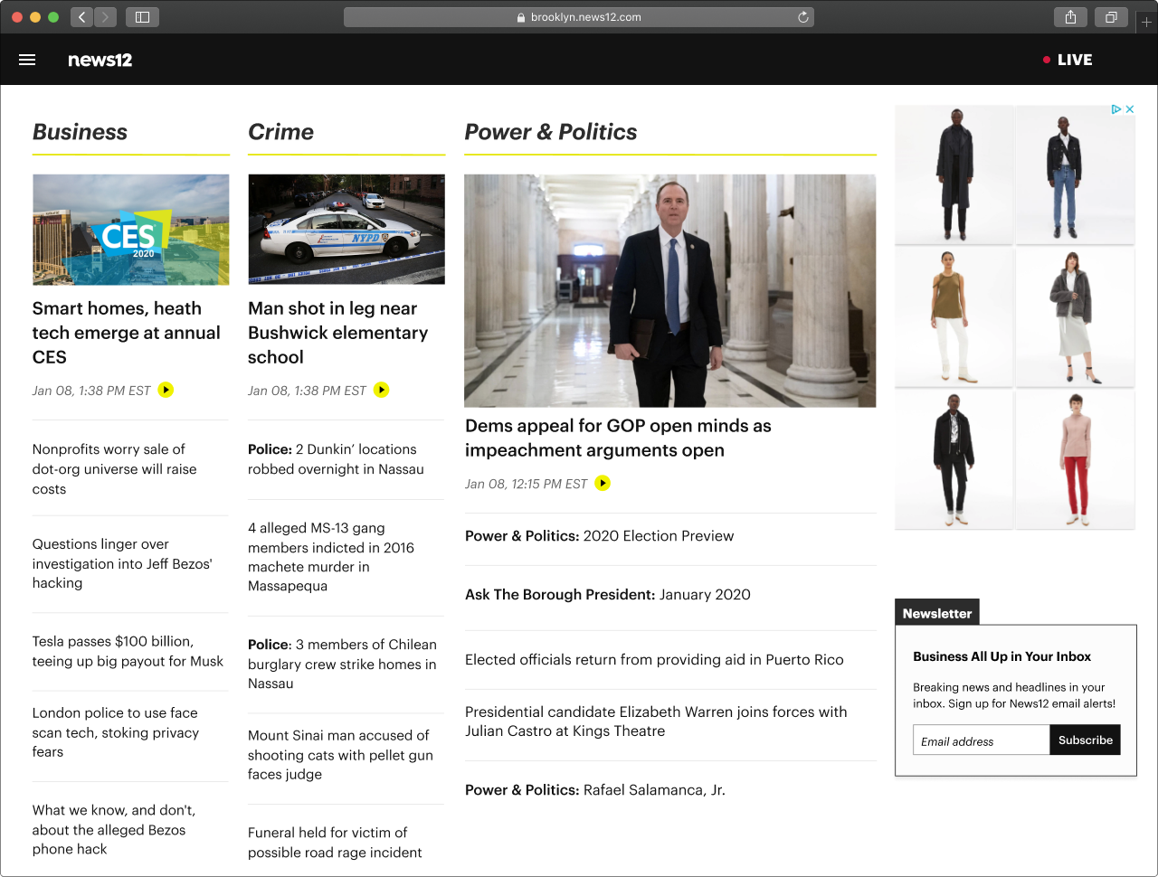
Old News12 website below
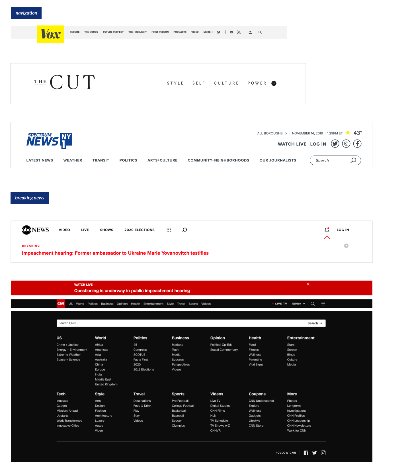
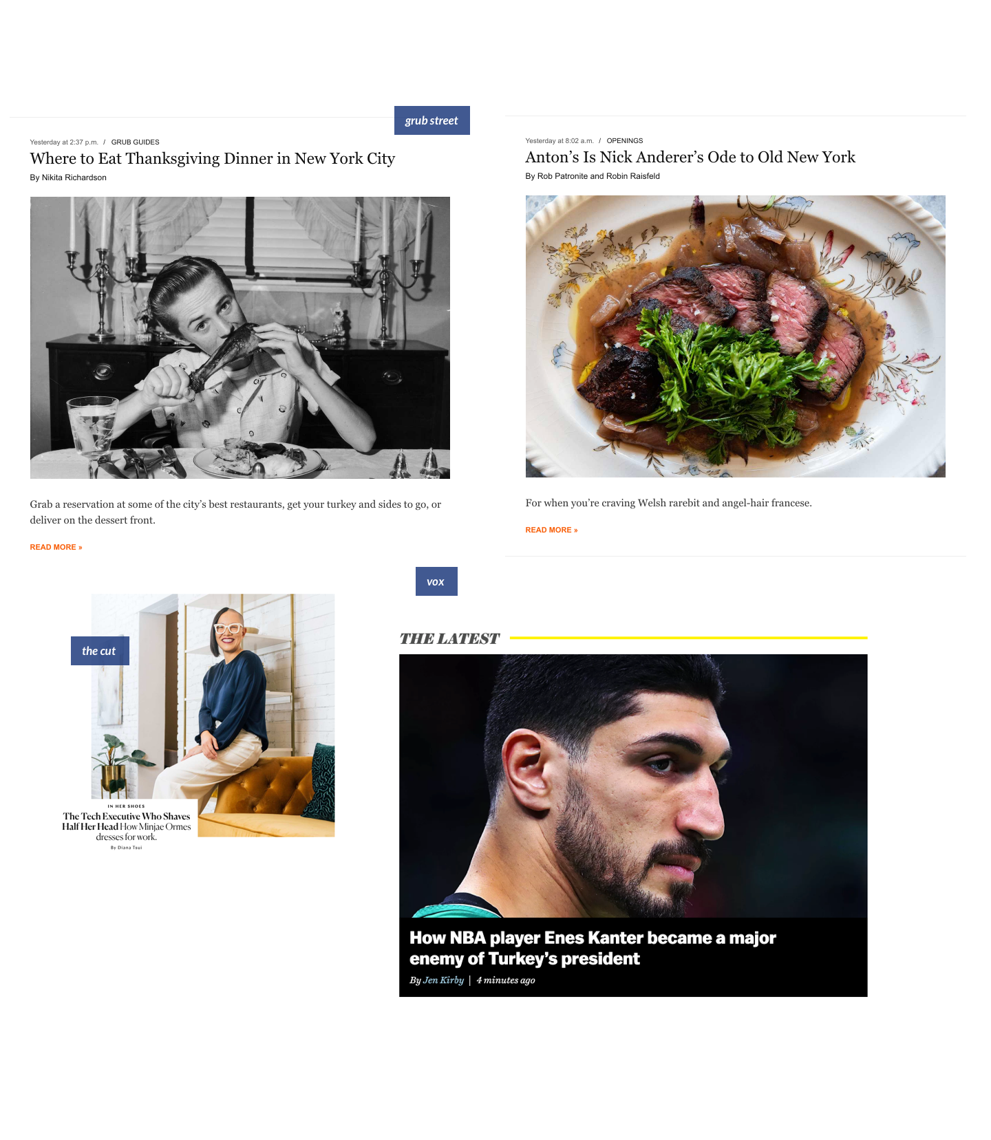
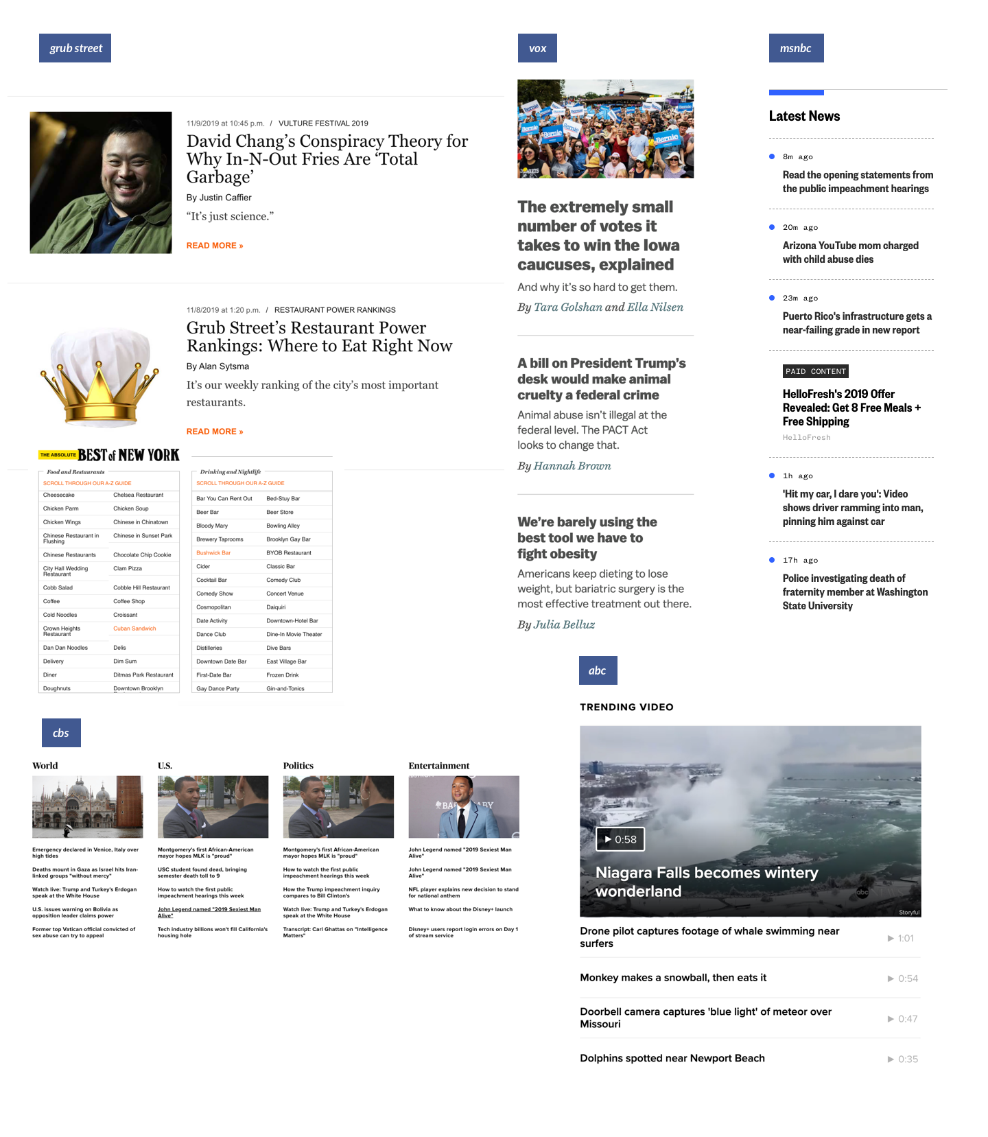
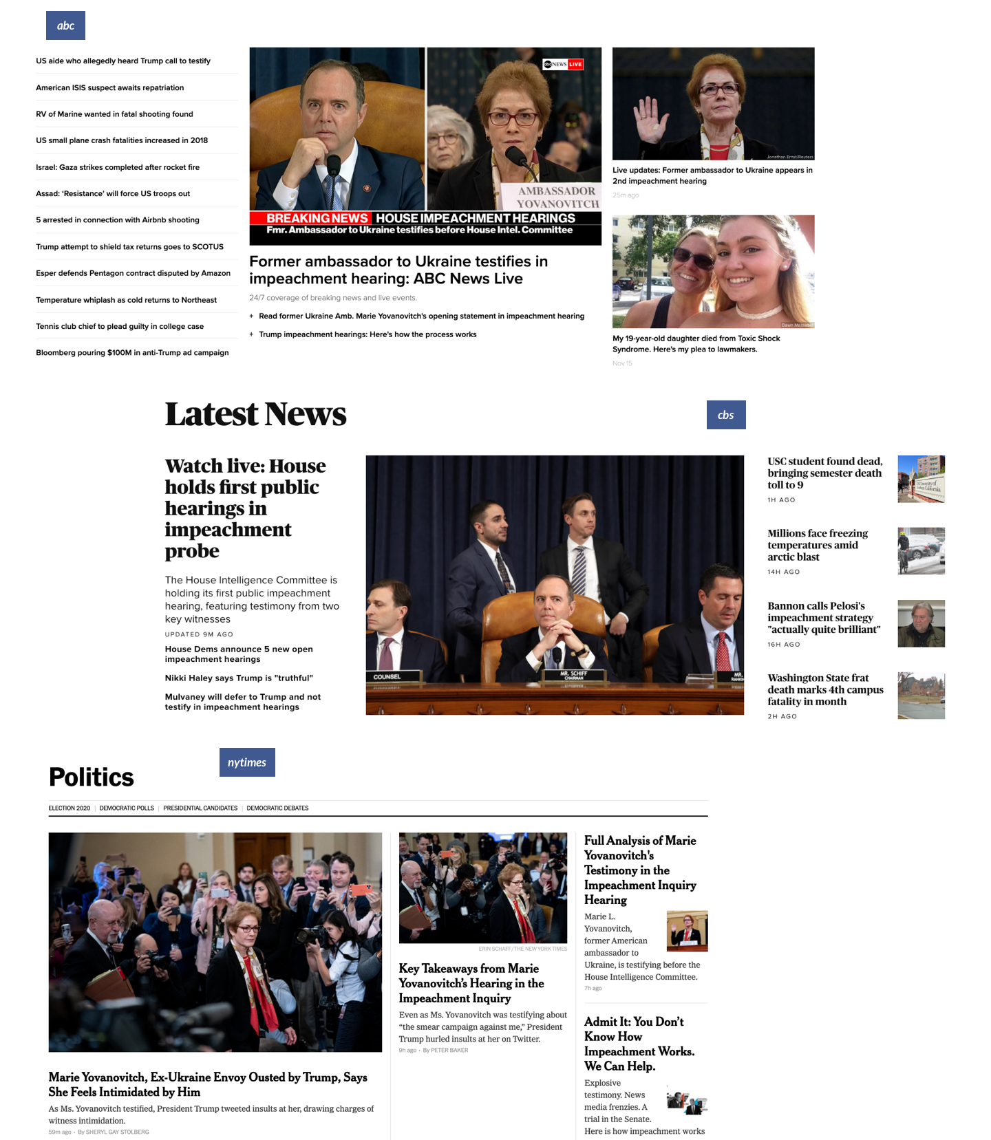
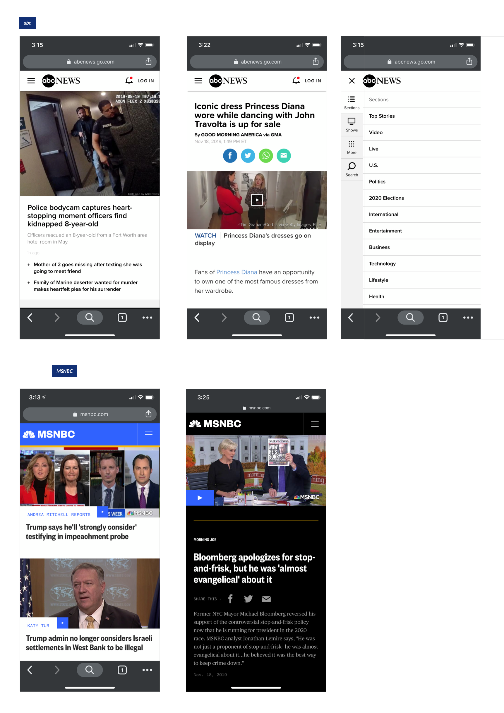
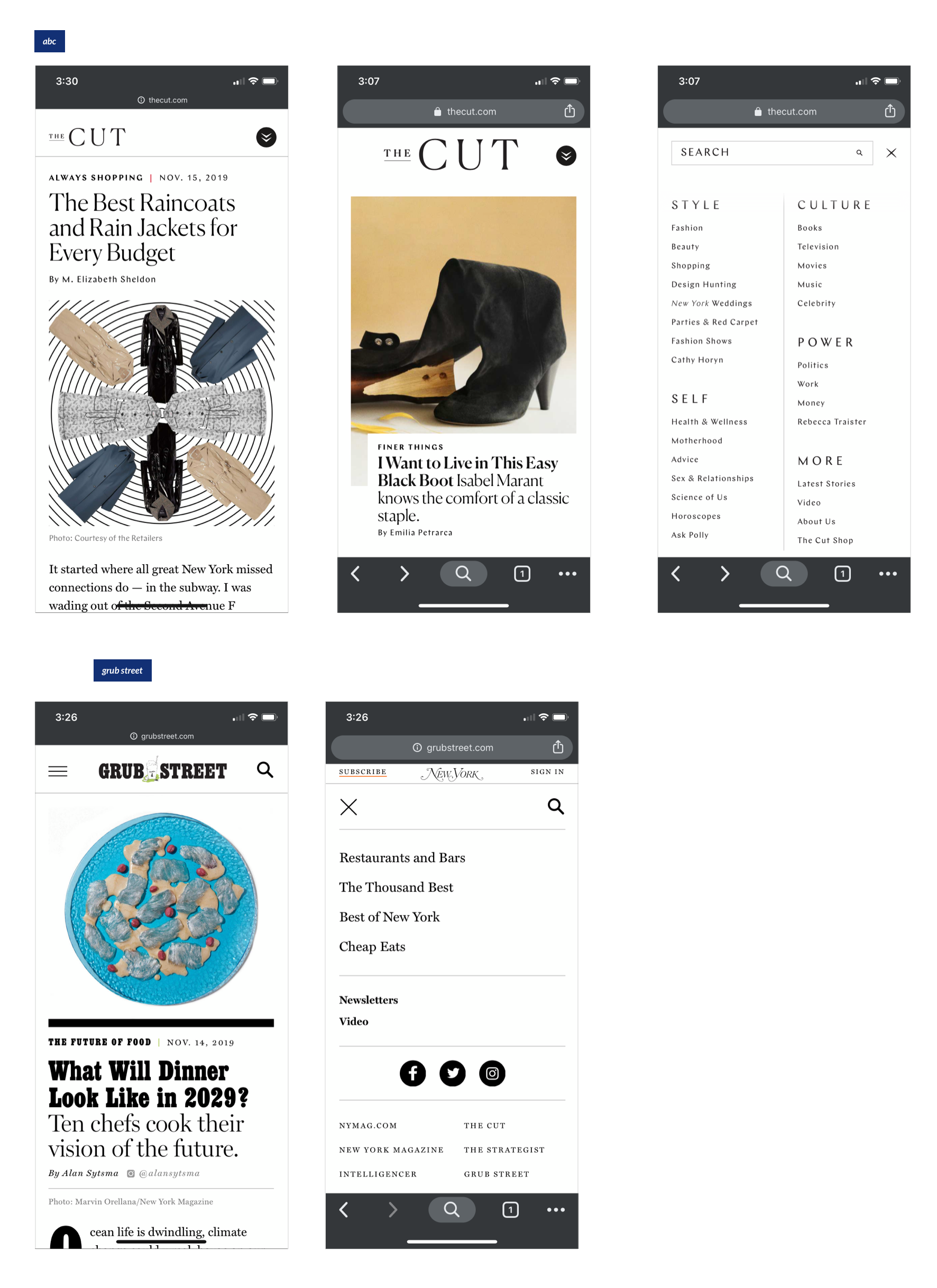
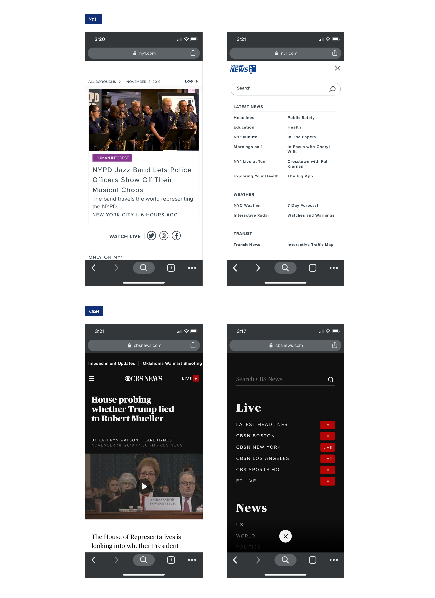
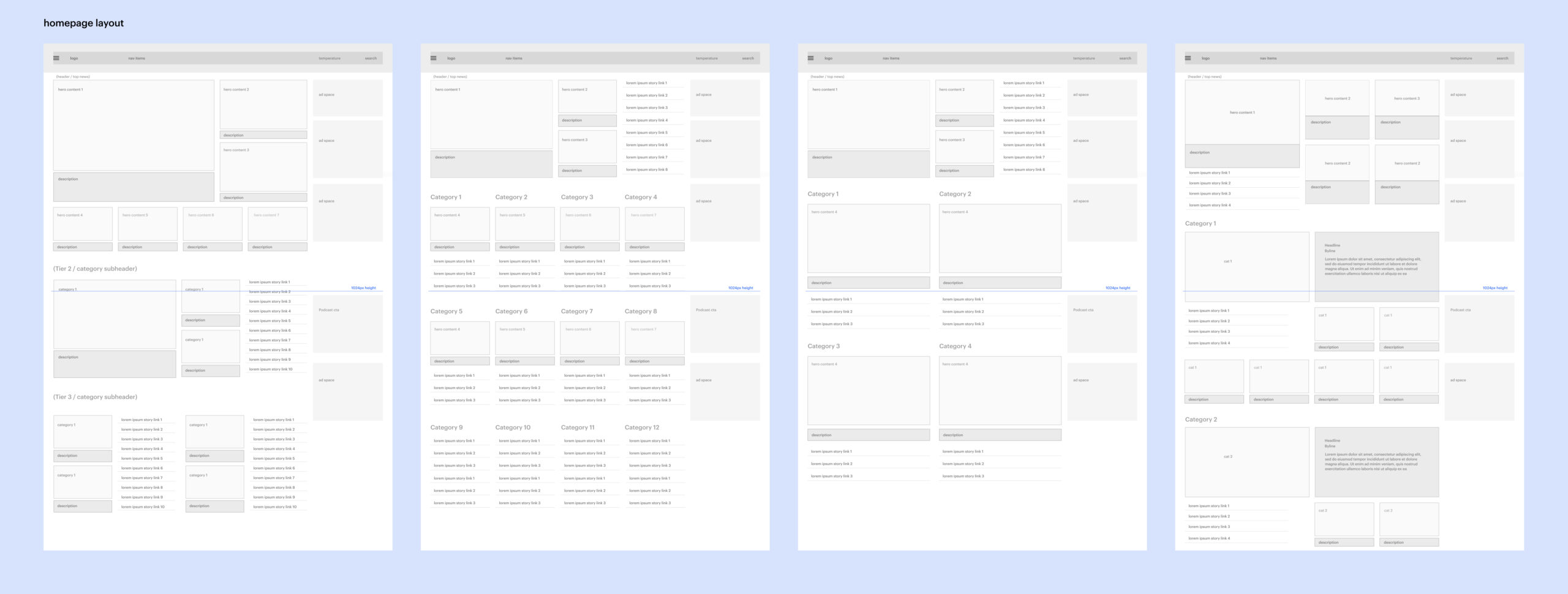
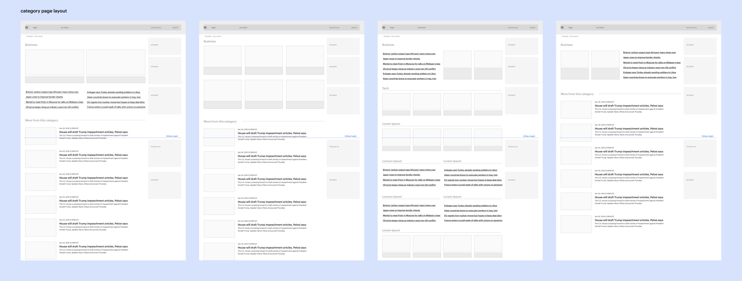
During the discovery phase, we spent most of our time interviewing stakeholders and users of the site current News12 site. We also explored new ideas with mood boards and competitive analysis. Once we had a general idea of what the News12 team was looking for, we started sketching out new layout variations for the site.
Mood Boards
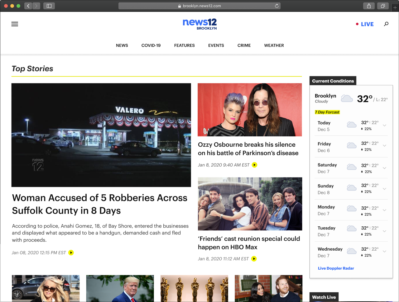
Initial layout ideas for the desktop experience
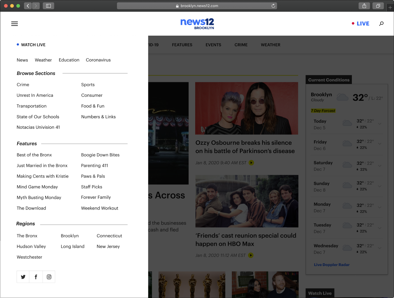
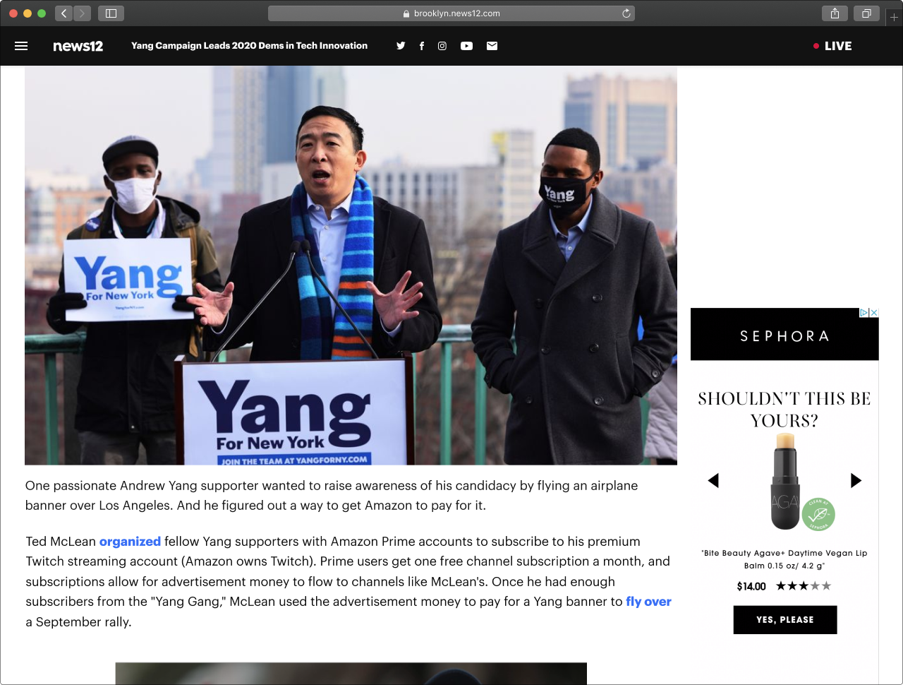
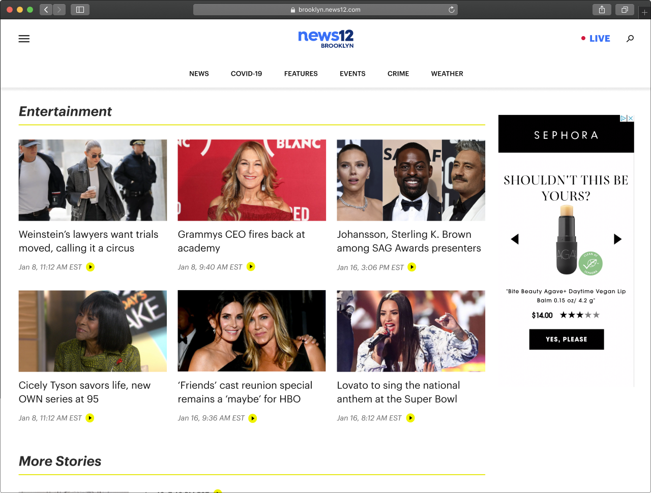
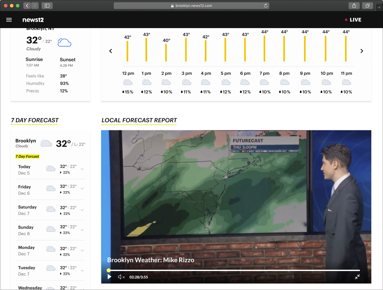
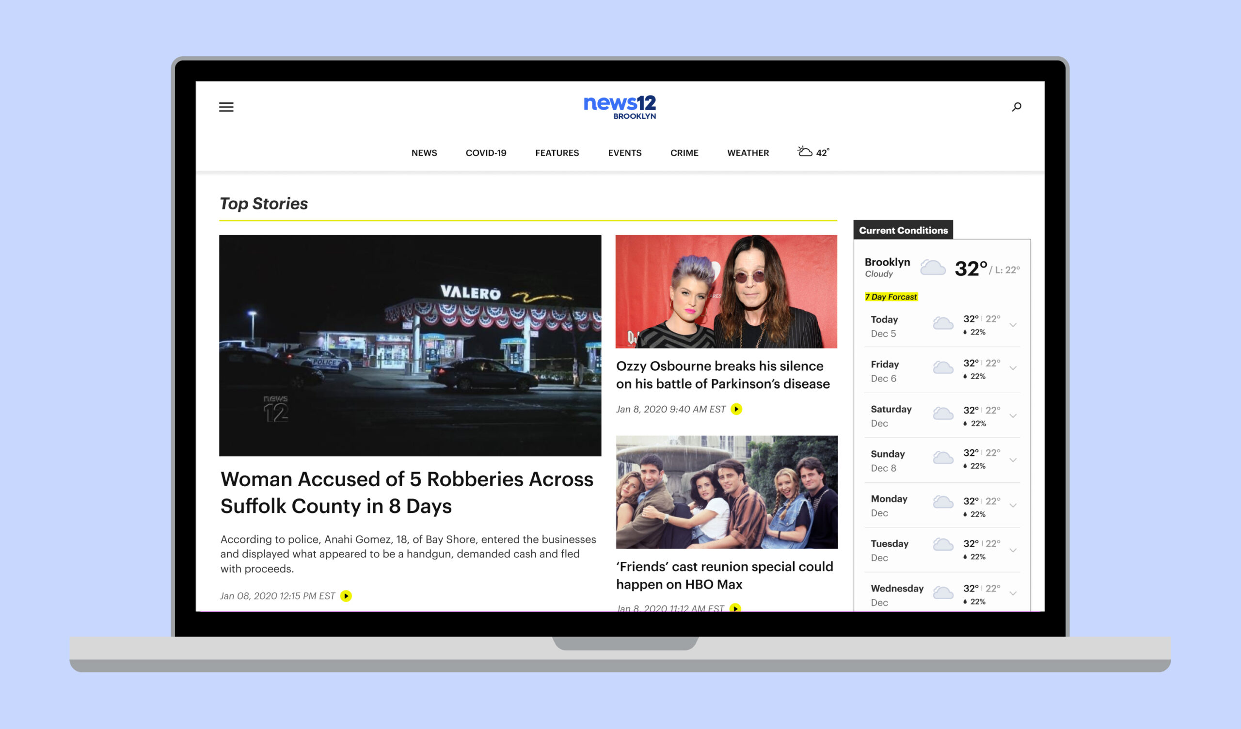
News12 MVP final designs
Navigation: 1440px - 1024px
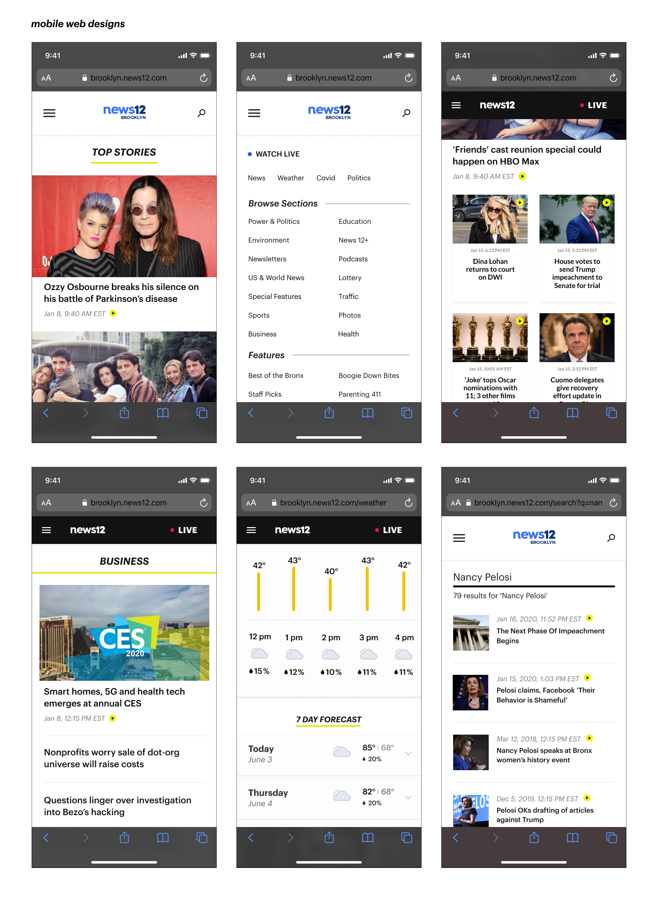
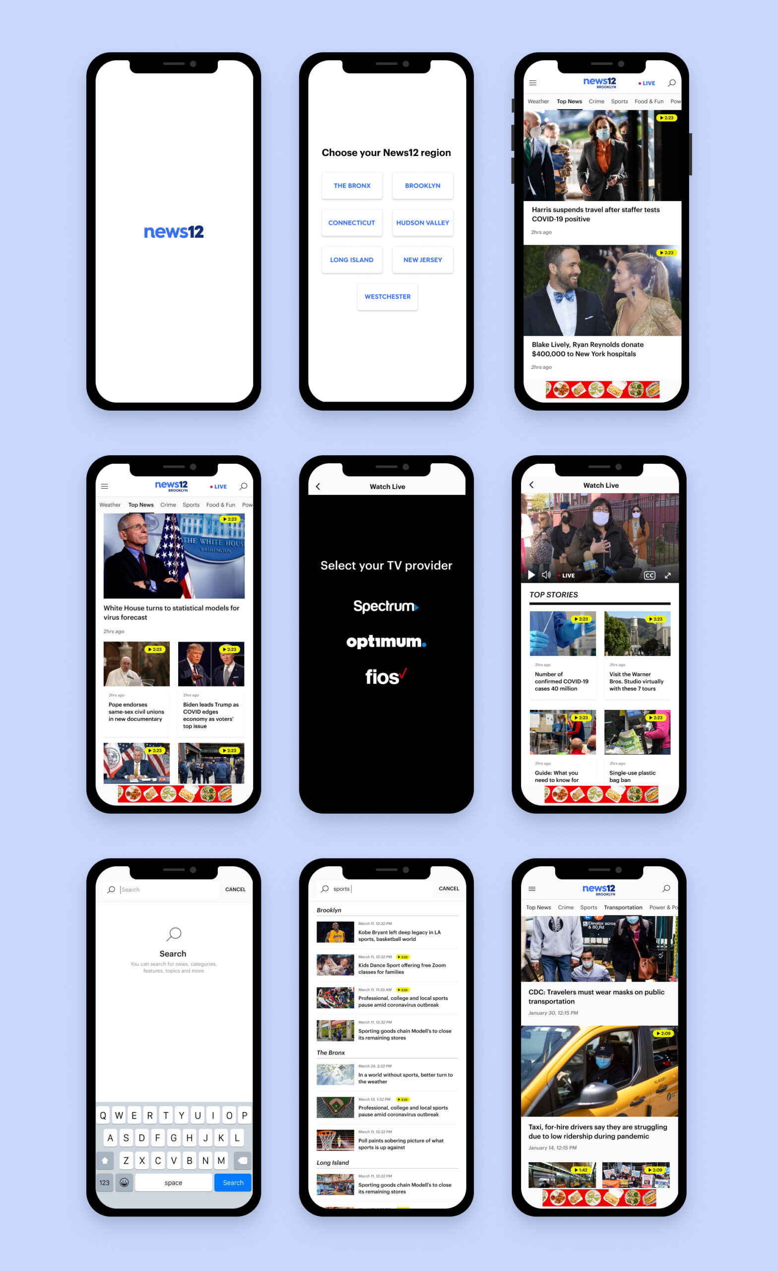
Scope and technical constraints for iOS and Android app experience
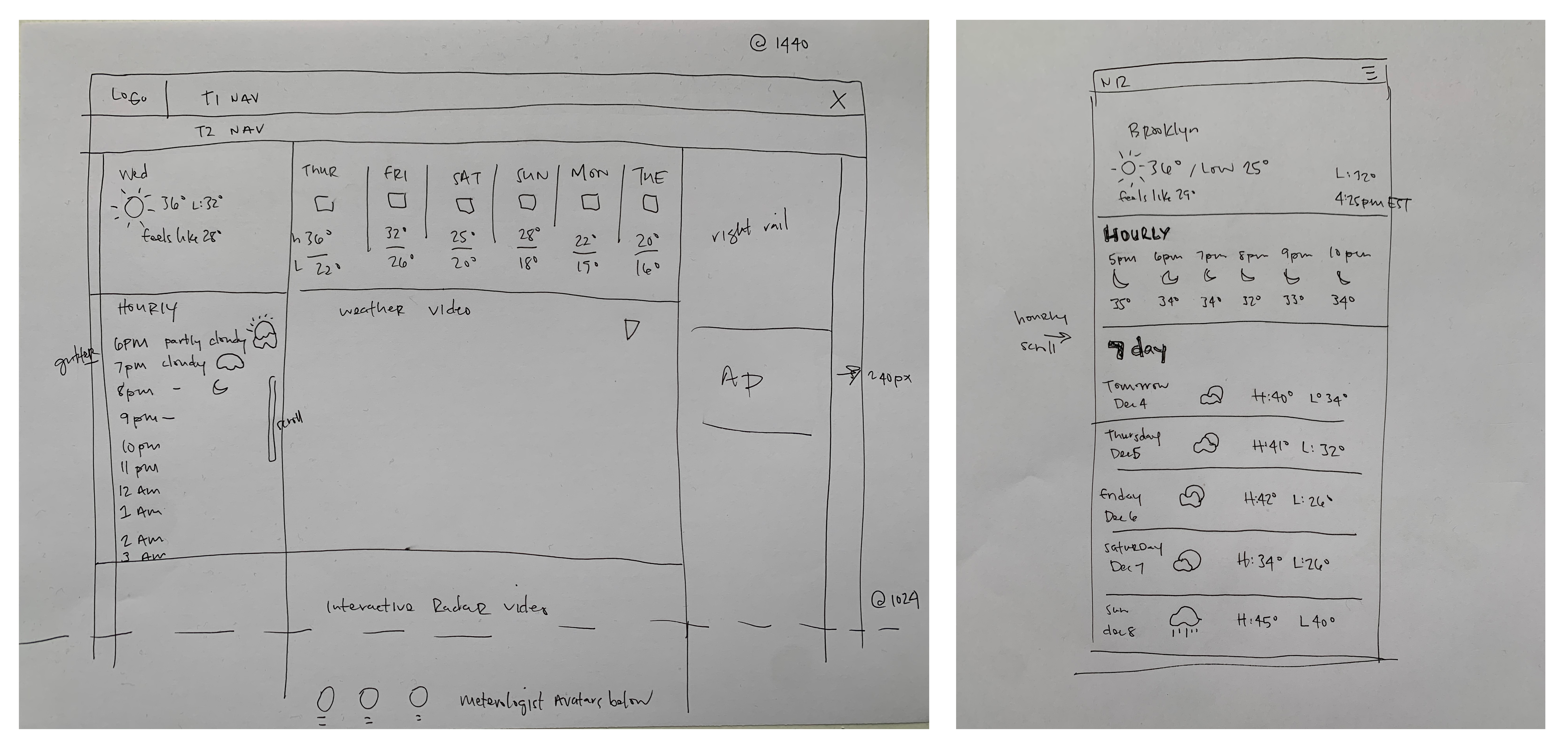
- Use mobile web designs for weather
- We will build a new settings screen right after launch, so for now, we kept it listed below the region selector
- Sticky footer ad is needed, so avoid bottom navigation
How might a user access the livestream?
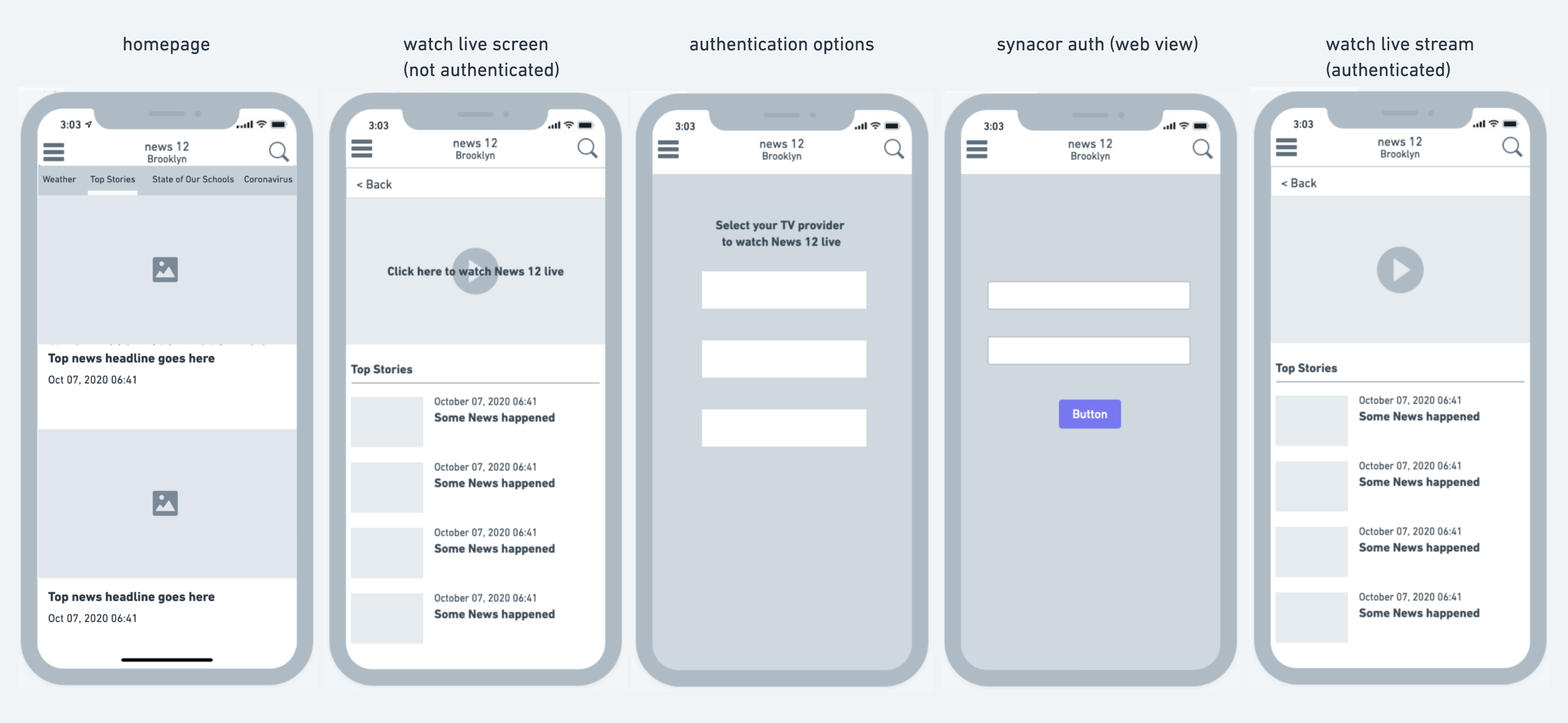
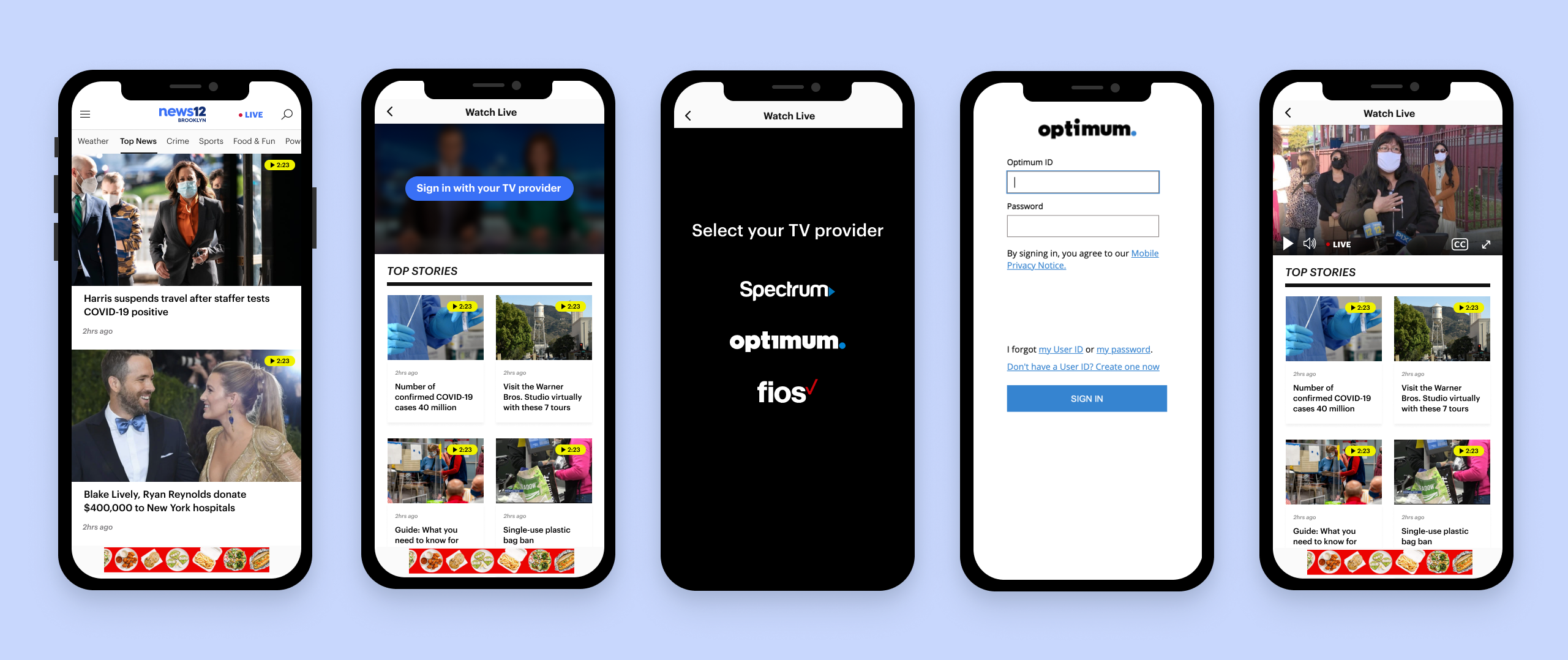
Final MVP Designs
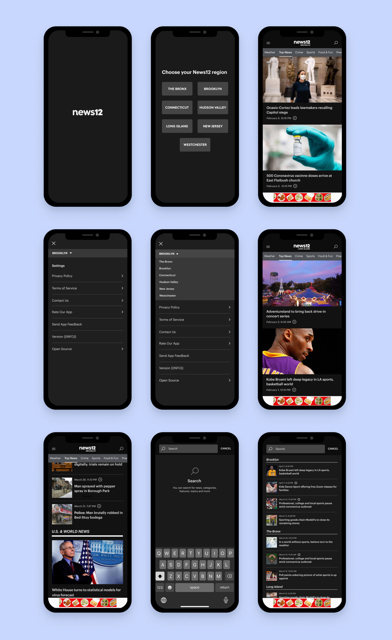
Dark Mode
Selected Works

Crunchbase AI ProfilesProduct Design
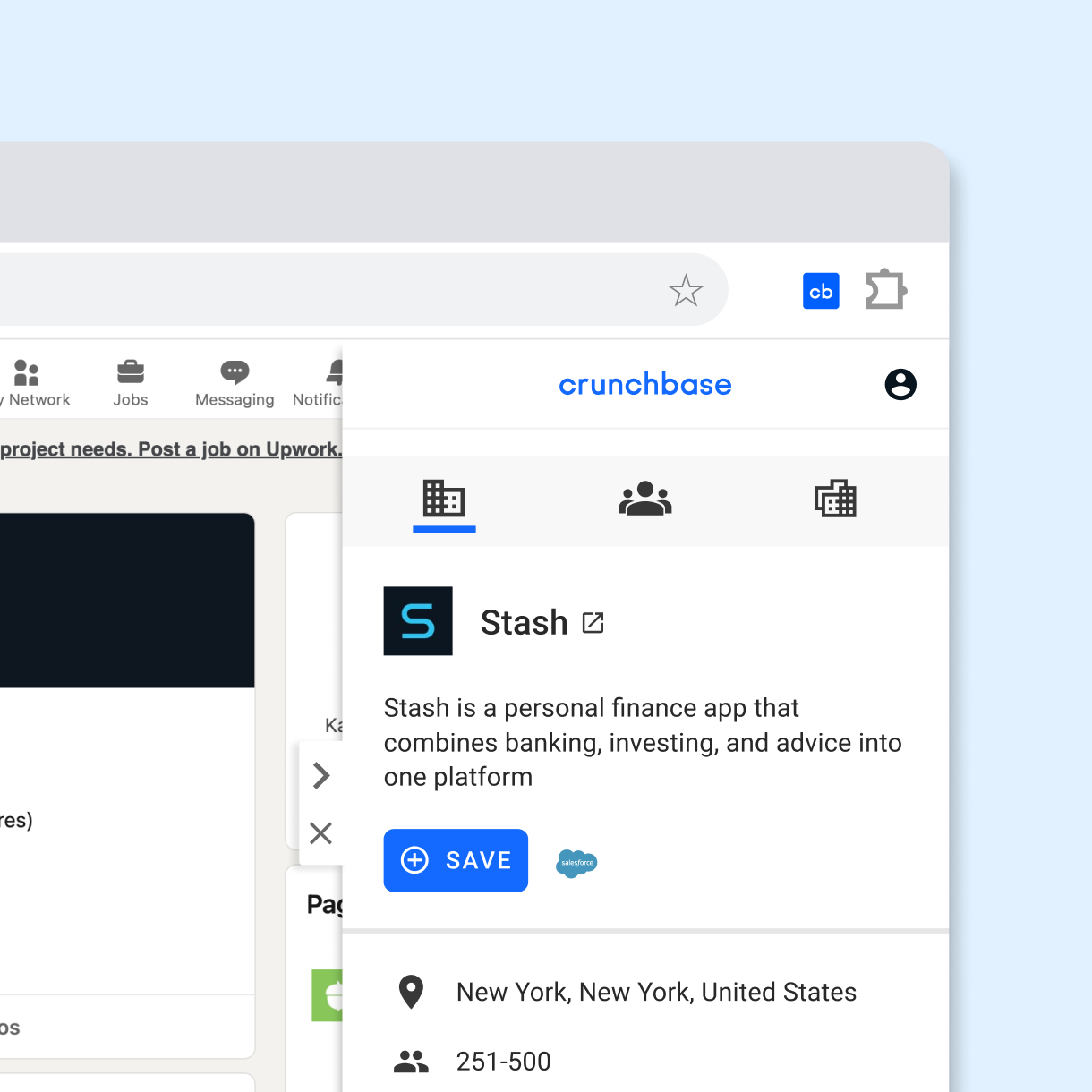
Crunchbase Chrome ExtensionProduct Design
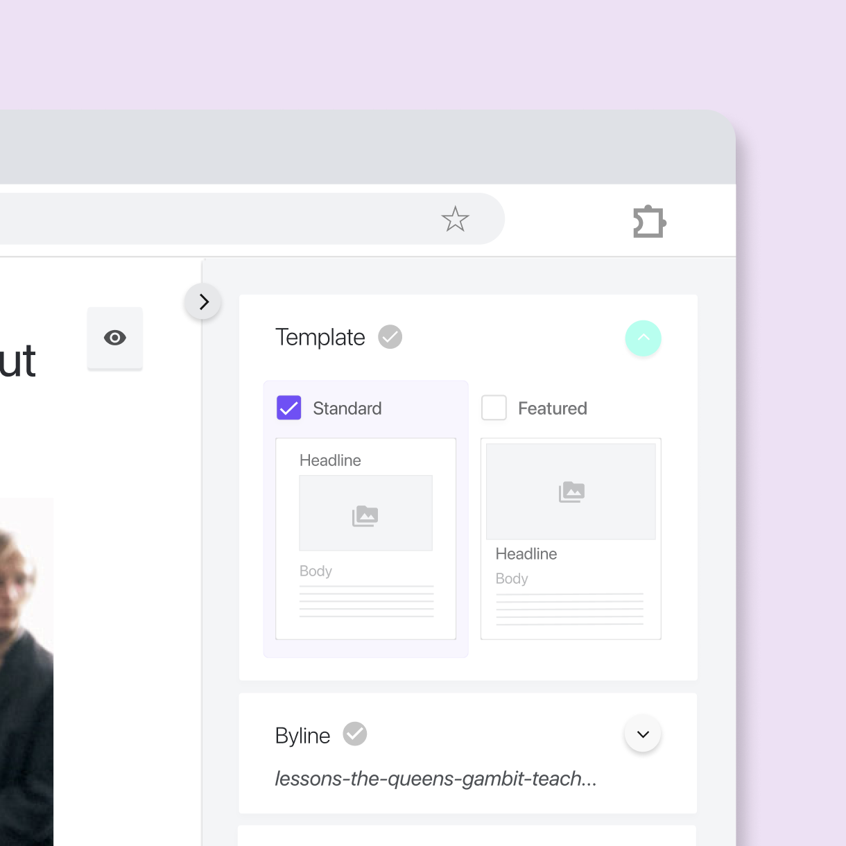
Cheddar + News12 CMSProduct Design
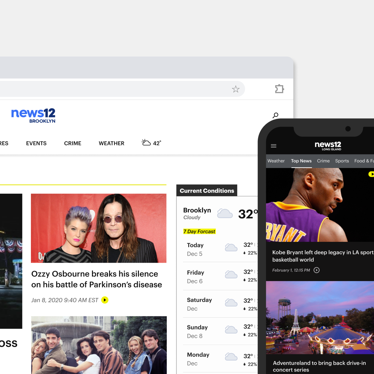
News12 Web & App ExperienceProduct Design
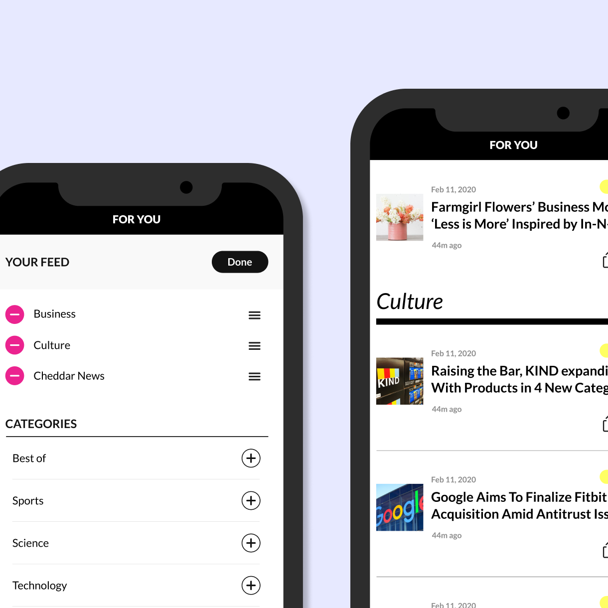
Cheddar Content PersonalizationProduct Design
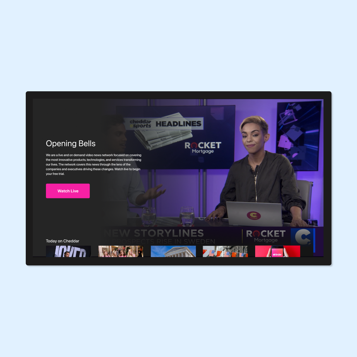
Cheddar tvOS experienceProduct Design
Pinterest Place PinsUI / UX
Visually WorkspaceUI / UX
Audubon Climate ReportUI / UX
Mapzen UI DesignUI Design
Body Metrics, Tech MuseumExperience Design
Little ShadowsMFA Design +Technology Thesis
DSI TableParsons
Midi TypewriterParsons MFA D+T
IllustrationProject type
Algorithmic AnimationOpenframeworks
John WhitneyOpenframeworks
