
Altice Content Management System
The challenge was to redesign the CMS to be more user-friendly and help writers and editors feel more confident creating content quickly. The redesign's outcome was that writers/editors who used the tool felt more control of their workflow process. They could write a story with minimal distractions and get it published on the website asap.
The user: Cheddar & News12 editorial teams
Main stakeholder: VP of Digital at Altice
Cheddar team: Director of Product Management, Sr. Product Manager, 5 engineers, and myself
My role: Research, user flows & stories, sketching, wireframing, visual design, prototyping
Project Duration: June 2020 - September 2020
Altice Content Management System
The challenge was to redesign the CMS to be more user-friendly and help writers and editors feel more confident creating content quickly. The redesign's outcome was that writers/editors who used the tool felt more control of their workflow process. They could write a story with minimal distractions and get it published on the website ASAP.
The user: Cheddar & News12 editorial teams
Main stakeholder: VP of Digital at Altice
Cheddar team: Director of Product Management, Sr. Product Manager, 5 engineers, and myself
My role: Research, user flows & stories, sketching, wireframing, visual design, prototyping
Project Duration: June 2020 - September 2020
The Problem:
The existing workflow for creating a story was too complex
- 3rd party software was not customized to specific user needs
- No support for publishing an article to multiple sites
- Costs $50k/month
The Problem:
The existing workflow for creating a story was too complex
- 3rd party software was not customized to specific user needs
- No support for publishing an article to multiple sites
- Costs $50k/month
The Problem:
The existing workflow for creating a story was too complex
- 3rd party software was not customized to specific user needs
- No support for publishing an article to multiple sites
- Costs $50k/month
The Problem:
The existing workflow for creating a story was too complex
- 3rd party software was not customized to specific user needs
- No support for publishing an article to multiple sites
- Costs $50k/month
Project Goals
Flexible content drafting
Whether it’s a video report supplemented by a written analysis, a gallery of storm pictures submitted by our users, or a multipart special feature, our new CMS will allow us to select the right template quickly and drop content into it easily.
Visual content styling
The new CMS will allow us to include assets from a media library on the template, type text into article fields such as the title and body, then apply styling to those assets and text, all without any requirement to learn CSS, markup, or markdown. Drafting should be familiar and quick, based on our many previous experiences with other drafting apps such as Google Docs and Evernote.
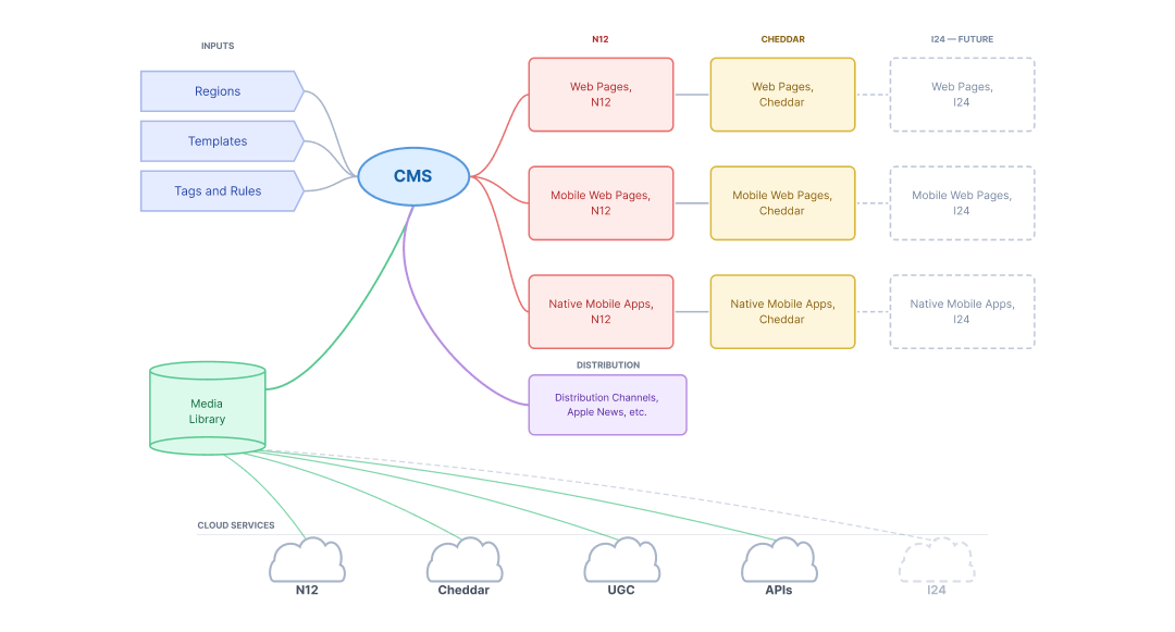
Broad Asset Sharing
One of the most promising benefits of our combined operations is the ability to share assets across news organizations, beginning with the seven regions of News 12 and Cheddar. The new CMS will draw upon the videos, images, articles, and other assets of our combined operations to achieve economies of scale, e.g., create once and use anywhere.
Accurate story previewing
It’s critical to have confidence that the final result matches the intended result at the moment of publication. We’ll be able to render each draft of a story using a true web browser engine for an accurate preview, whether for desktop, tablet or, mobile dimensions.
Project Goals
Flexible content drafting
Whether it’s a video report supplemented by a written analysis, a gallery of storm pictures submitted by our users, or a multipart special feature, our new CMS will allow us to select the right template quickly and drop content into it easily.
Visual content styling
The new CMS will allow us to include assets from a media library on the template, type text into article fields such as the title and body, then apply styling to those assets and text, all without any requirement to learn CSS, markup, or markdown. Drafting should be familiar and quick, based on our many previous experiences with other drafting apps such as Google Docs and Evernote.
Broad Asset Sharing
One of the most promising benefits of our combined operations is the ability to share assets across news organizations, beginning with the seven regions of News 12 and Cheddar. The new CMS will draw upon the videos, images, articles, and other assets of our combined operations to achieve economies of scale, e.g., create once and use anywhere.
Accurate story previewing
It’s critical to have confidence that the final result matches the intended result at the moment of publication. We’ll be able to render each draft of a story using a true web browser engine for an accurate preview, whether for desktop, tablet or, mobile dimensions.
Discovery
For this specific project, mood boards were extremely helpful in gauging the team's initial thoughts on editing tools that already existed in the world. The majority of the writers and editors had already experimented with these editing tools. This naturally shifted the conversation to functionality and specifically has or has not worked for them in the past.
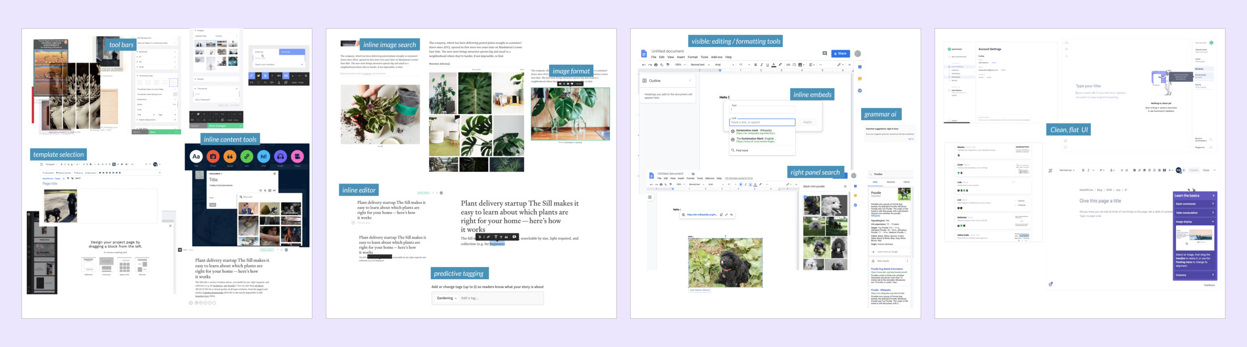
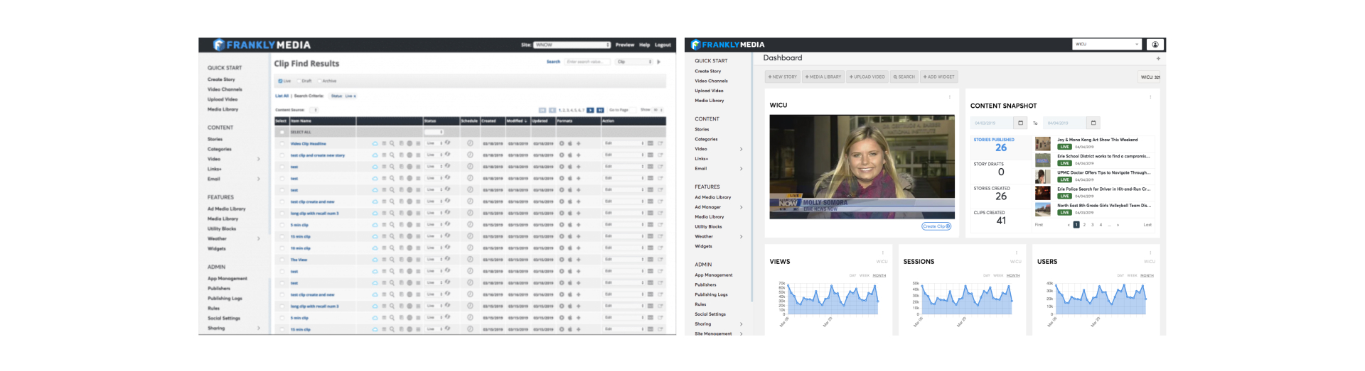
User personas were also helpful to write out during the discovery phase. Because we had met with the editorial team several times to go over their current 3rd party CMS (Frankly) and the specific pain points they were encountering, it was clear what each member of the team needed to enhance their workflow and reduce the amount of time it took to publish articles to the site.
News12 covers 7 local regions in the Tri-State area -- The Bronx, Brooklyn, Connecticut, Hudson Valley, Long Island, New Jersey, and Westchester. One major issue with the Frankly CMS was that they could not publish an article in more than one region. This use case was essential for their workflow to improve because they sent about 50% of their articles to two or more regions.
How might we simplify the workflow process for editorial?
Their existing drafting workflow involved several steps and outdated editing tools. What if we condensed the steps by adding cutting-edge editing tools that enabled editorial to work faster? We wanted to ensure that the CMS's workflow supported their vision for a streamlined, modern, productive website.
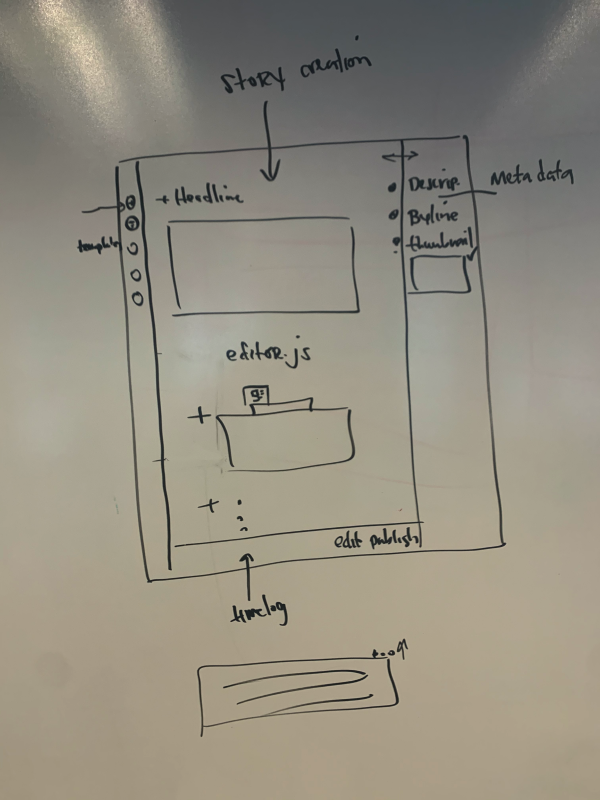
The initial sketches consist of layout ideas, inline editing tools, and inline media tools. We combined inline and right-side panel designs for the storytelling workflow for the first round of lo-fi prototypes. For example, would it be more intuitive to search inline for an image or search via a panel that's always present on the side of the screen? Will inline editing be robust enough for the more traditional writers who are used to having an editing toolbar always in view?
How might we simplify the workflow process for editorial?
Their existing drafting workflow involved several steps and outdated editing tools. What if we condensed the steps by adding cutting-edge editing tools that enabled editorial to work faster? We wanted to ensure that the CMS's workflow supported their vision for a streamlined, modern, productive website.
The initial sketches consist of layout ideas, inline editing tools, and inline media tools. We combined inline and right-side panel designs for the storytelling workflow for the first round of lo-fi prototypes. For example, would it be more intuitive to search inline for an image or search via a panel that's always present on the side of the screen? Will inline editing be robust enough for the more traditional writers who are used to having an editing toolbar always in view?
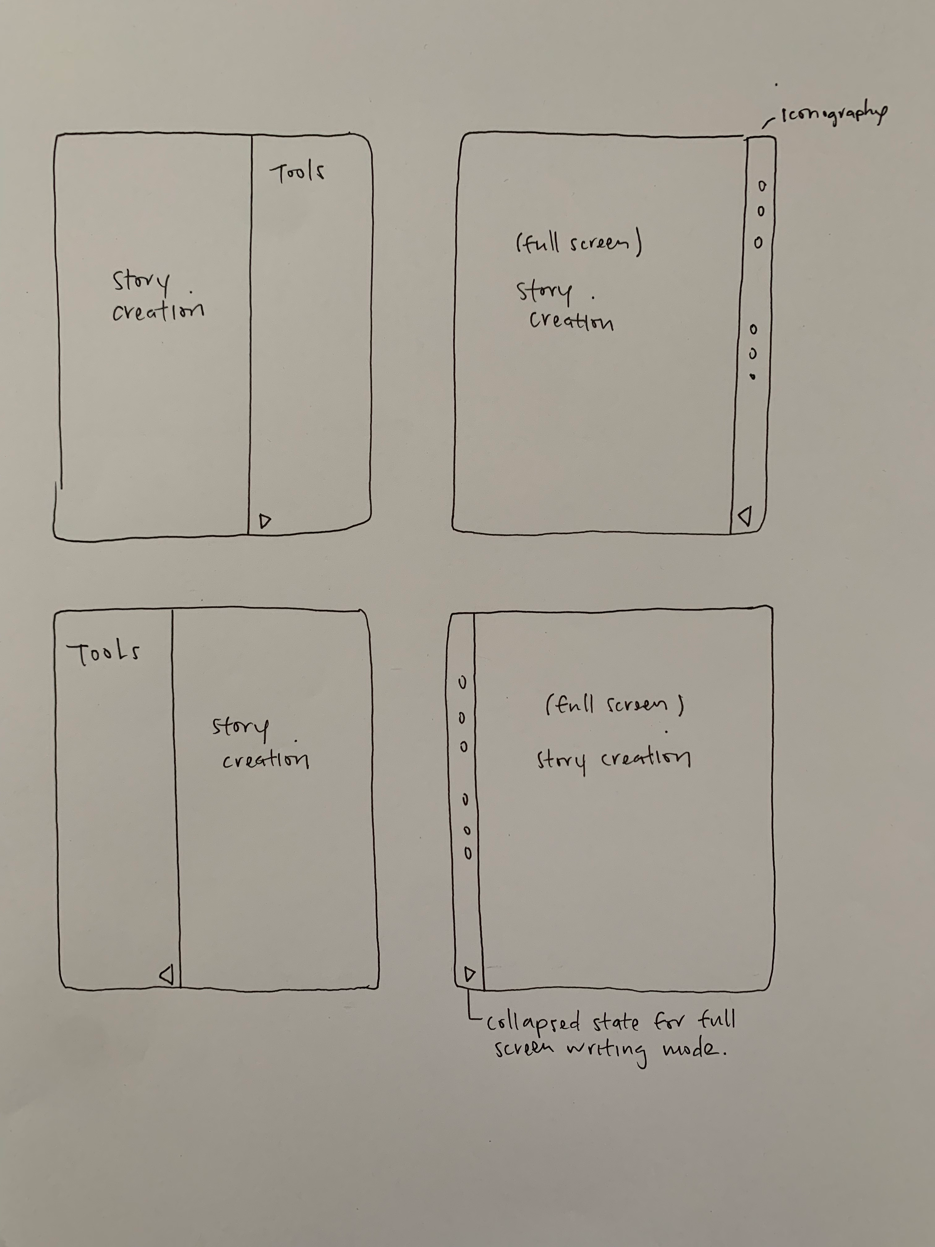
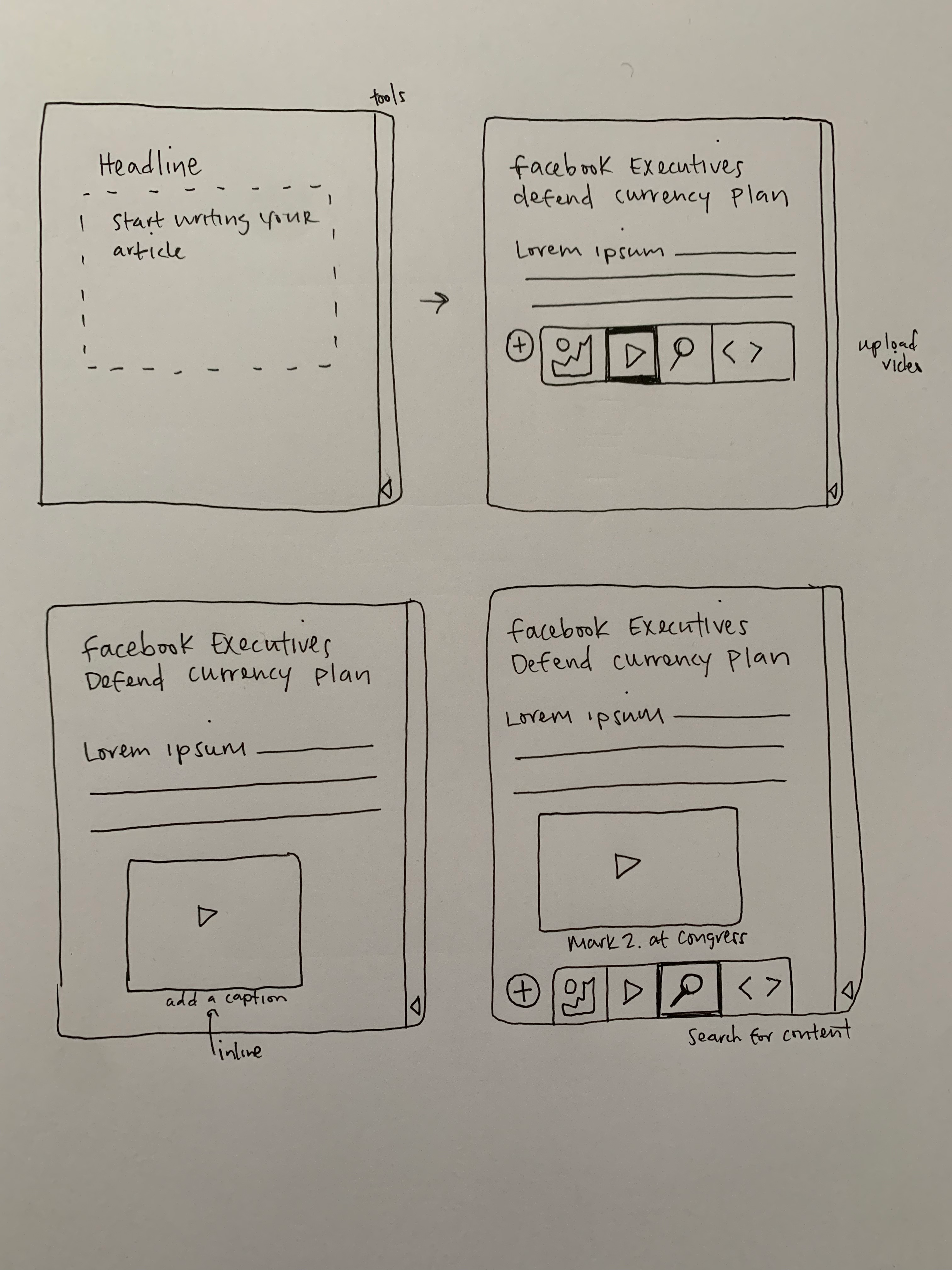
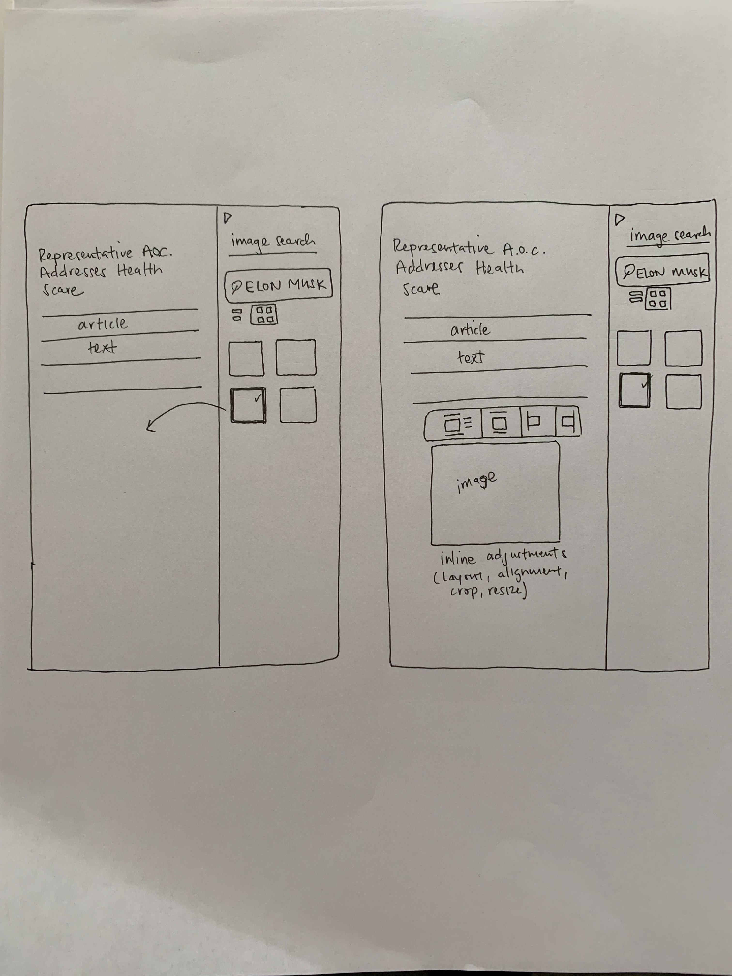
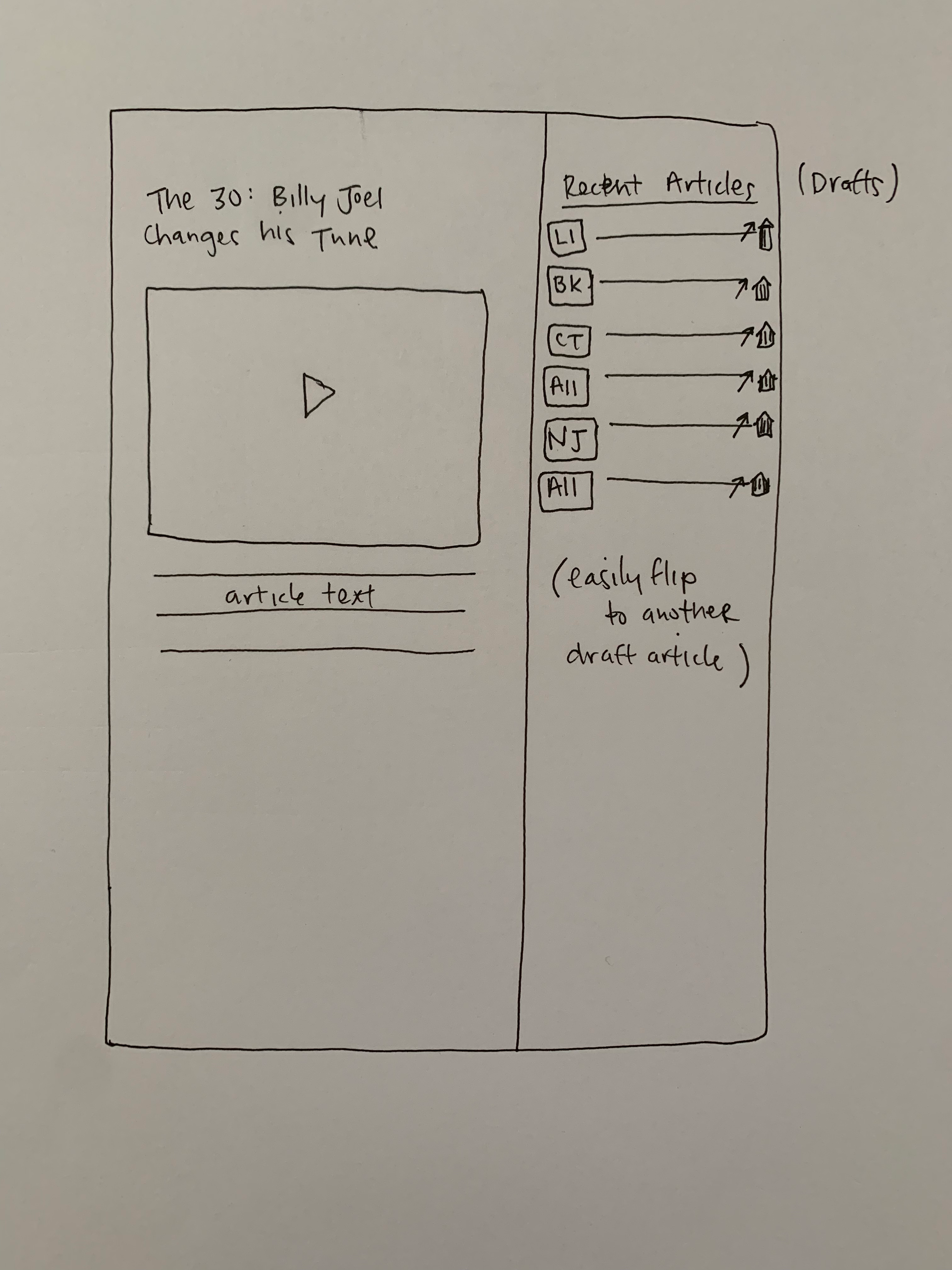
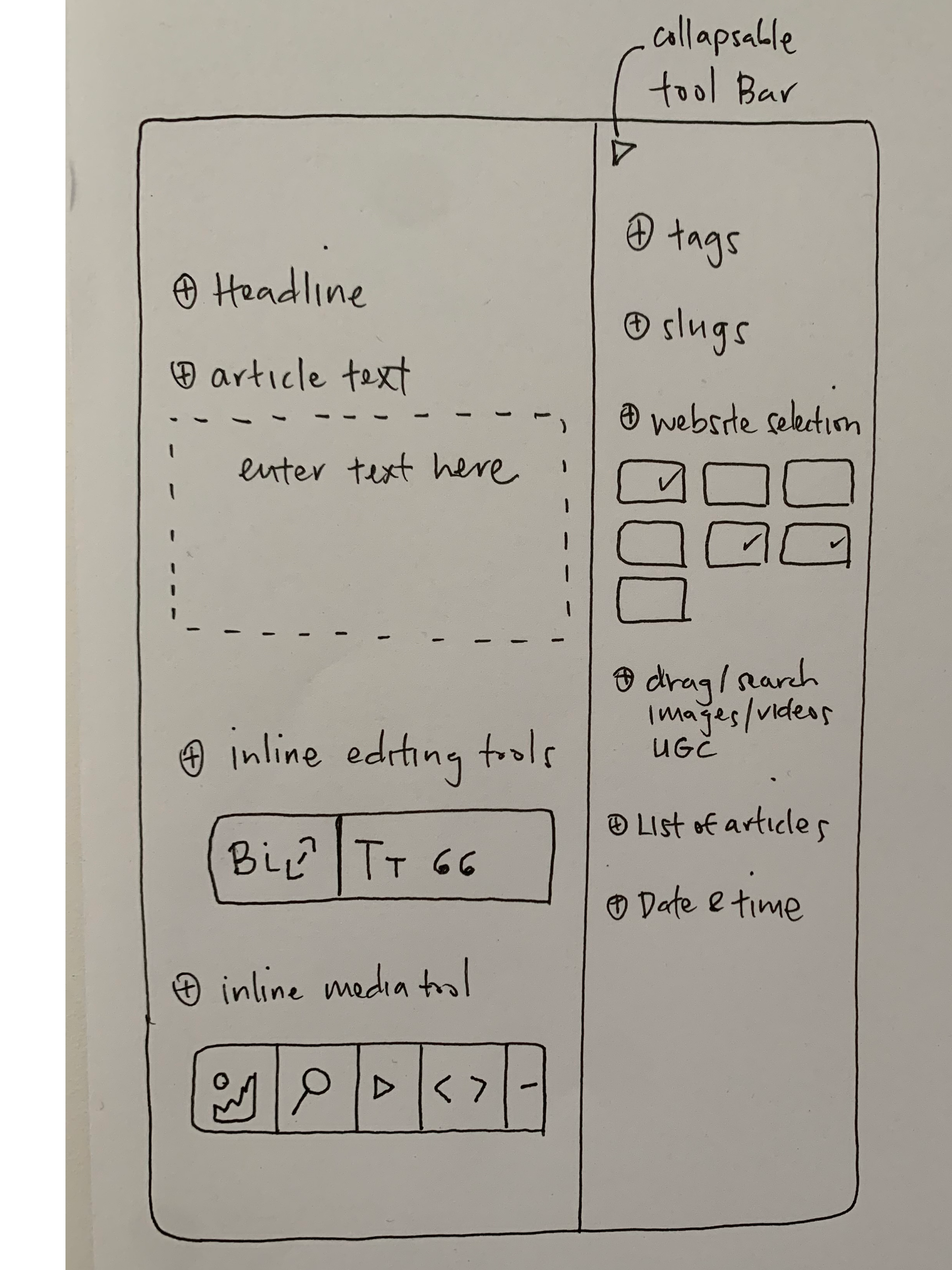
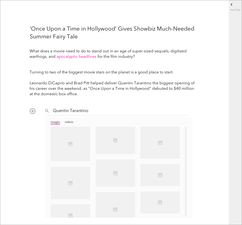
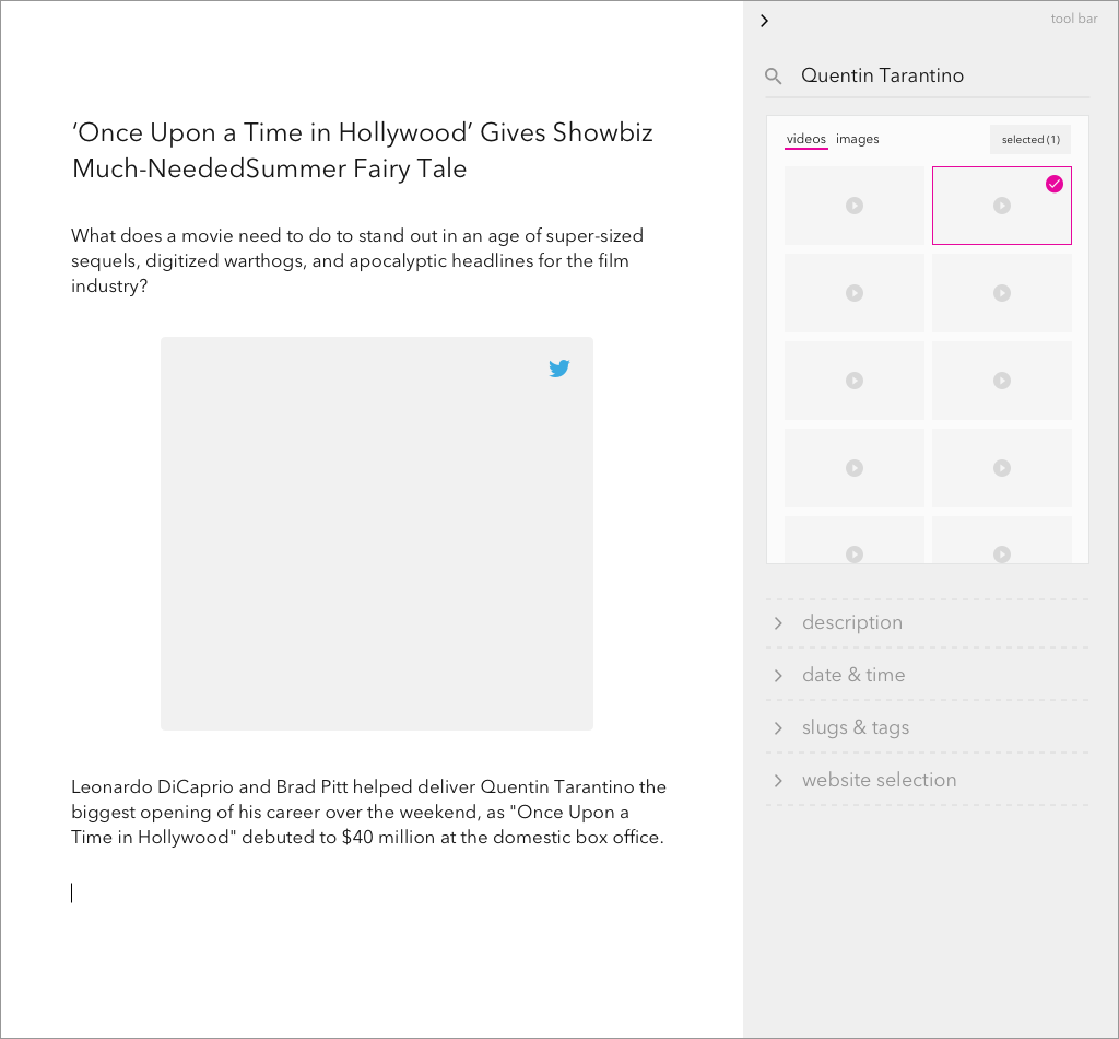
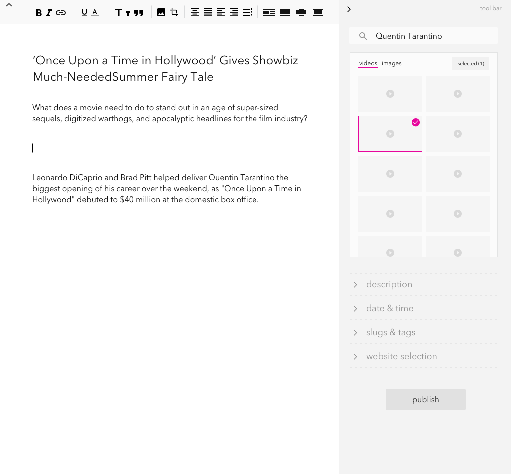
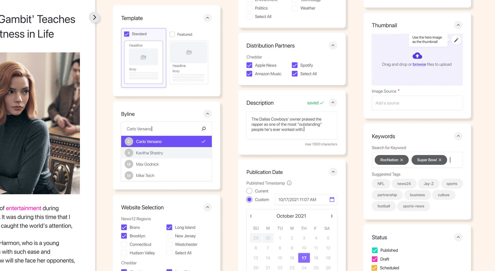
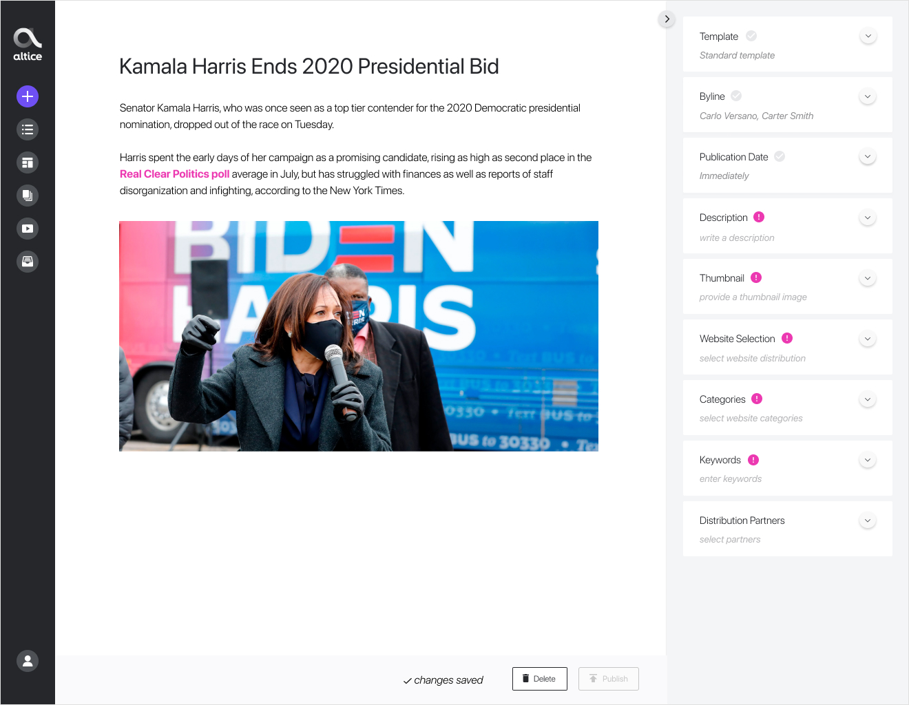
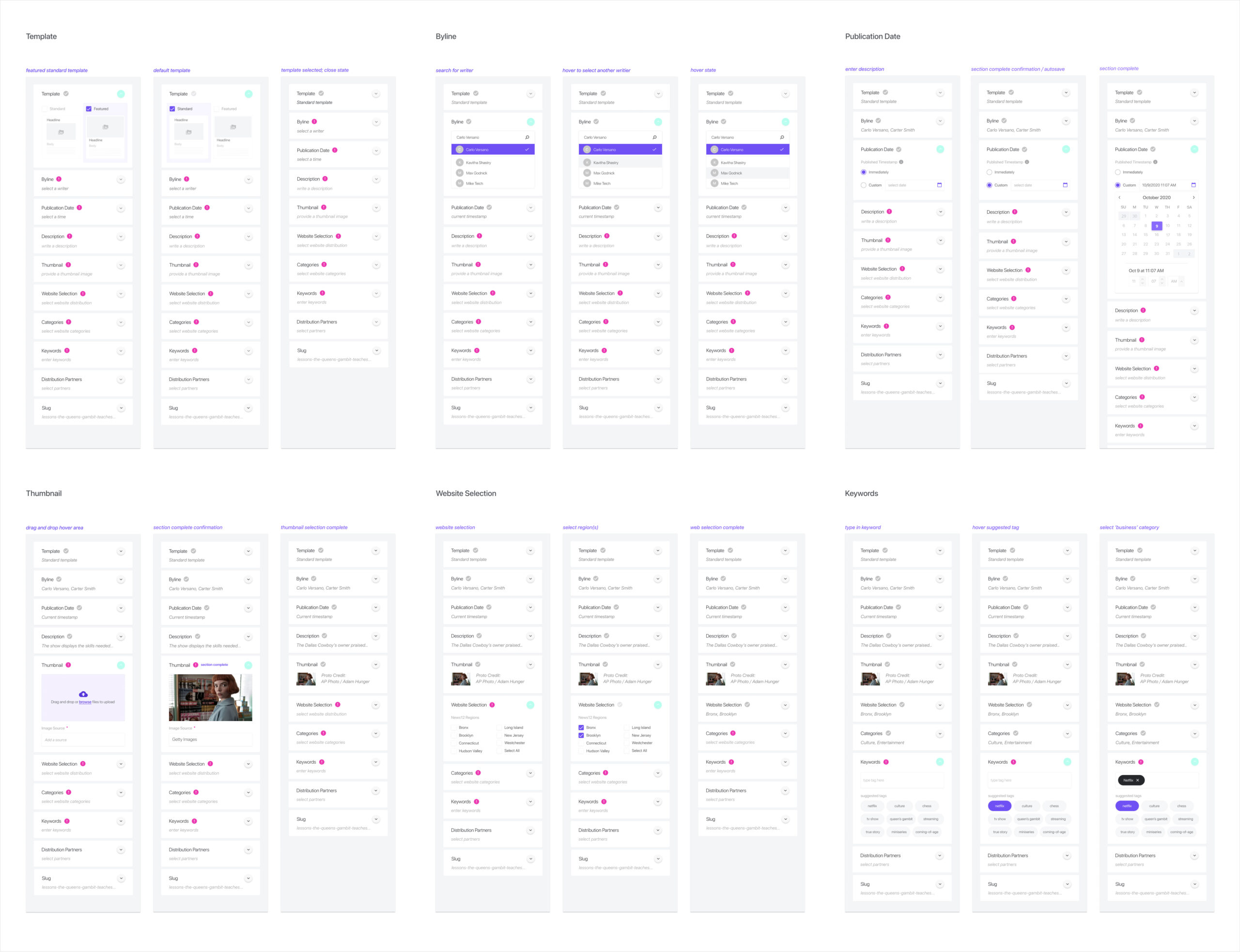
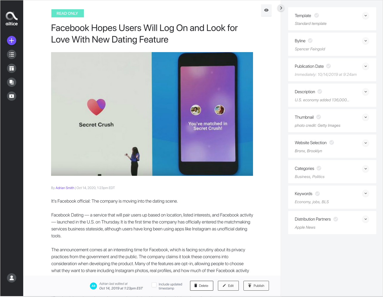
Once we conducted a few user testing sessions with editorial and discussed the various options above, it became clear that inline functionality was the most efficient way to add text, images, videos, and embeds. We did however need a section that housed all of the metadata for the story, such as the slug, description, byline, and other required information that would be displayed on the front end. We decided to separate the page into four main sections: The left-side navigation bar, the story/content creation space, the right-side toolbar for metadata, and the time log at the bottom.
Once we conducted a few user testing sessions with editorial and discussed the various options above, it became clear that inline functionality was the most efficient way to add text, images, videos, and embeds. We did however need a section that housed all of the metadata for the story, such as the slug, description, byline, and other required information that would be displayed on the front end. We decided to separate the page into four main sections: The left-side navigation bar, the story/content creation space, the right-side toolbar for metadata, and the time log at the bottom.
Once we conducted a few user testing sessions with editorial and discussed the various options above, it became clear that inline functionality was the most efficient way to add text, images, videos, and embeds. We did however need a section that housed all of the metadata for the story, such as the slug, description, byline, and other required information that would be displayed on the front end. We decided to separate the page into four main sections: The left-side navigation bar, the story/content creation space, the right-side toolbar for metadata, and the time log at the bottom.
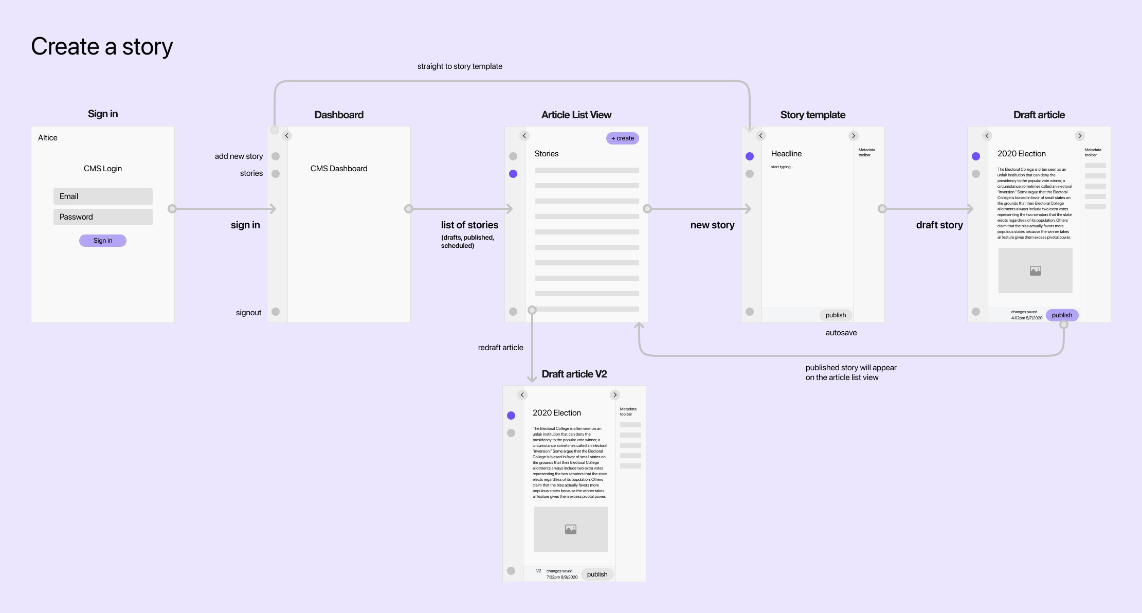
Before we examine these sections of the page in more detail, let's take a step back and look at the story creation flow that we proposed for the new CMS.
Before we examine these sections of the page in more detail, let's take a step back and look at the story creation flow that we proposed for the new CMS.
Before we examine these sections of the page in more detail, let's take a step back and look at the story creation flow that we proposed for the new CMS.
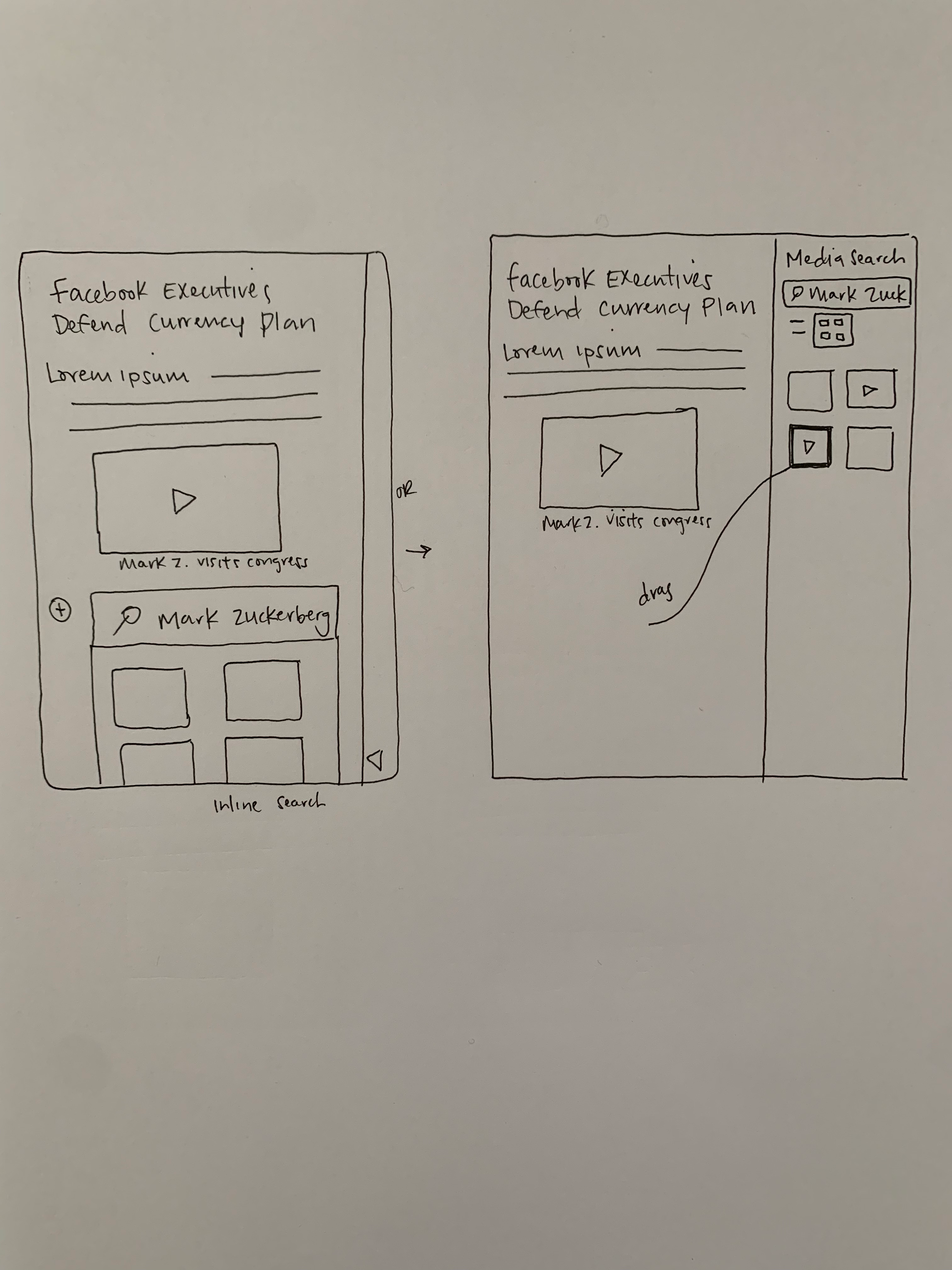
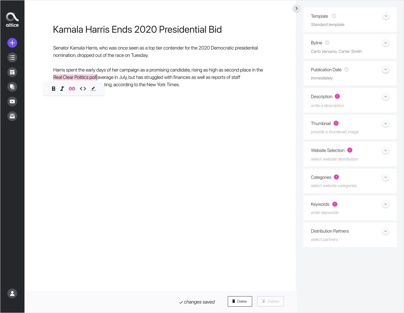
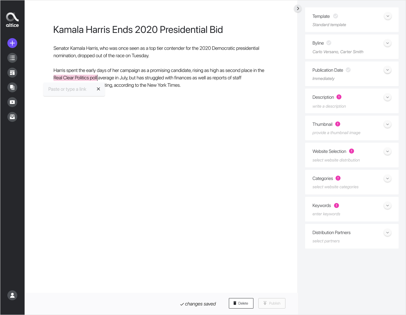
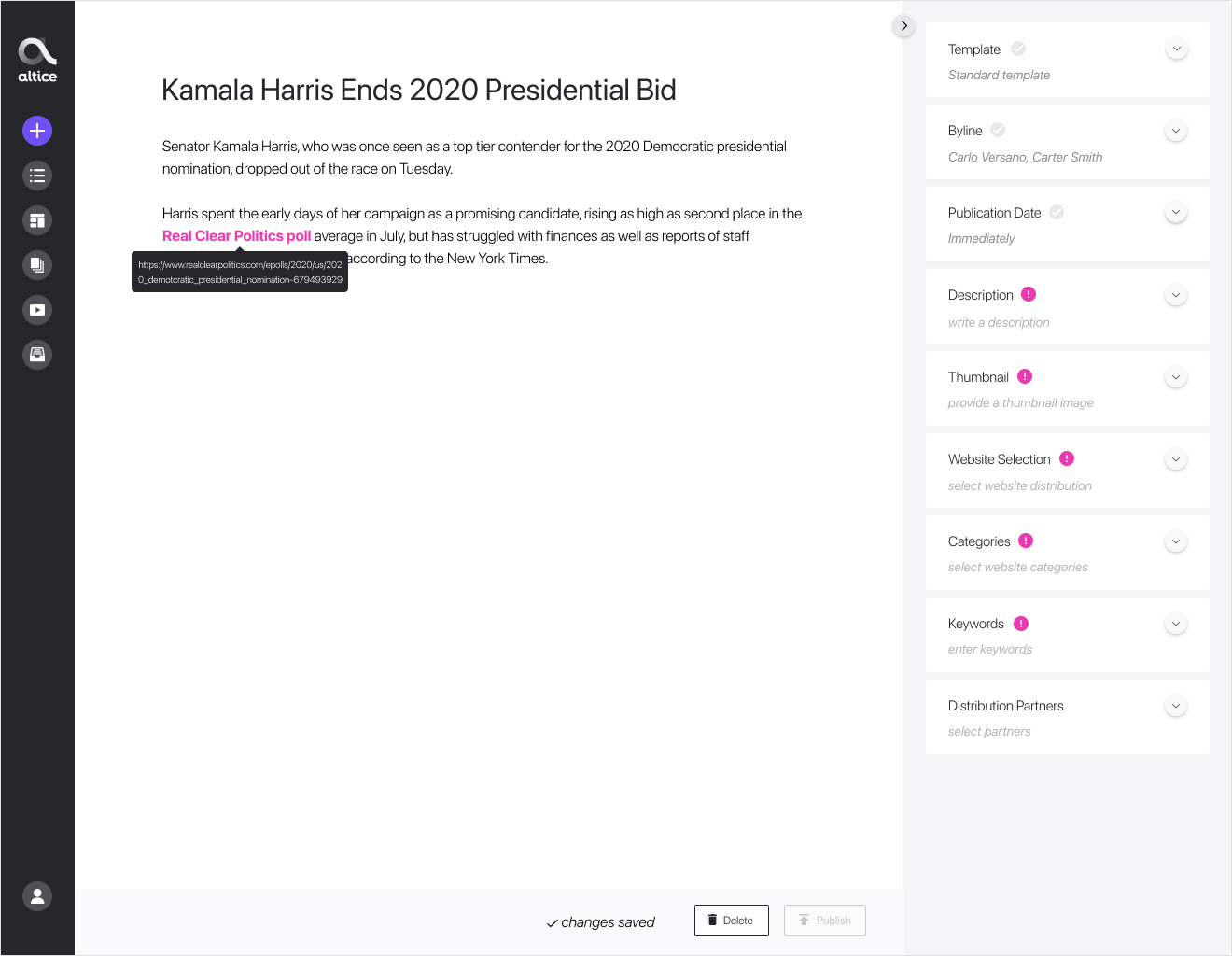
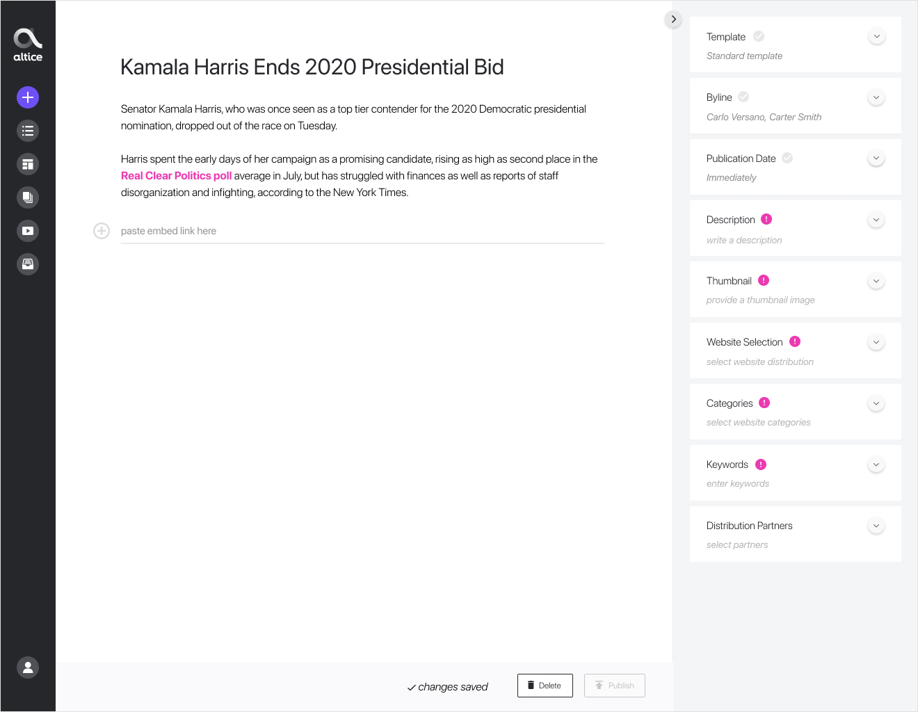
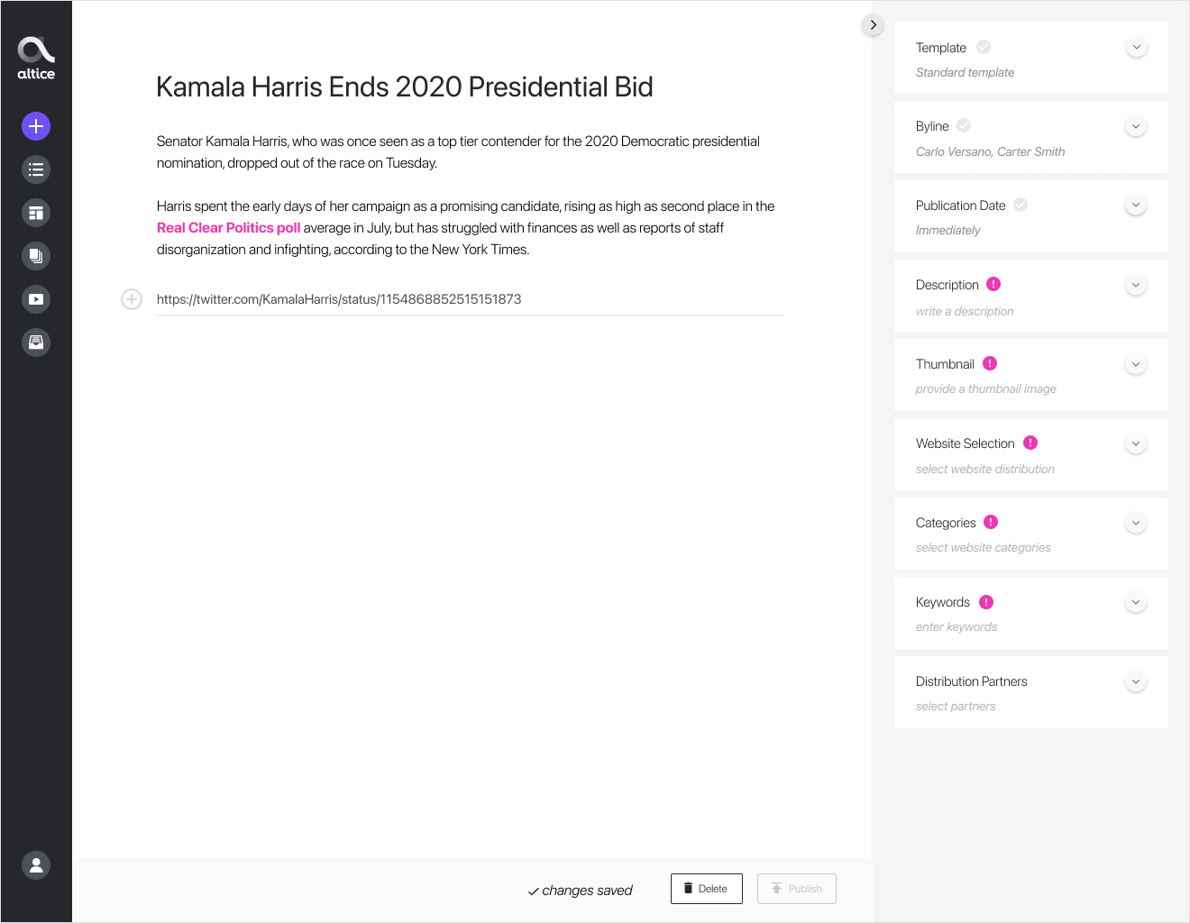
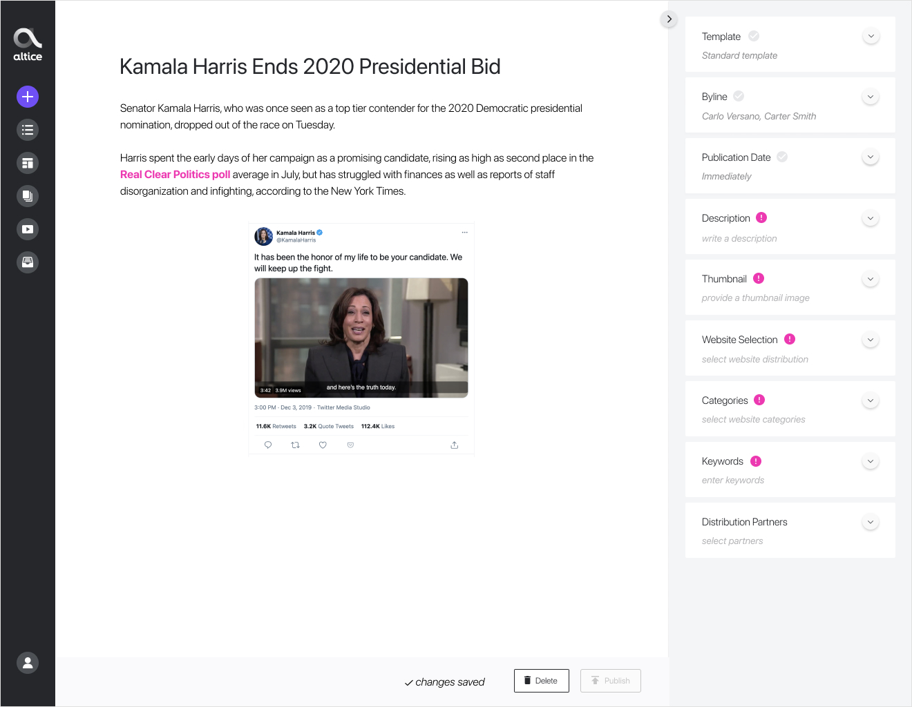
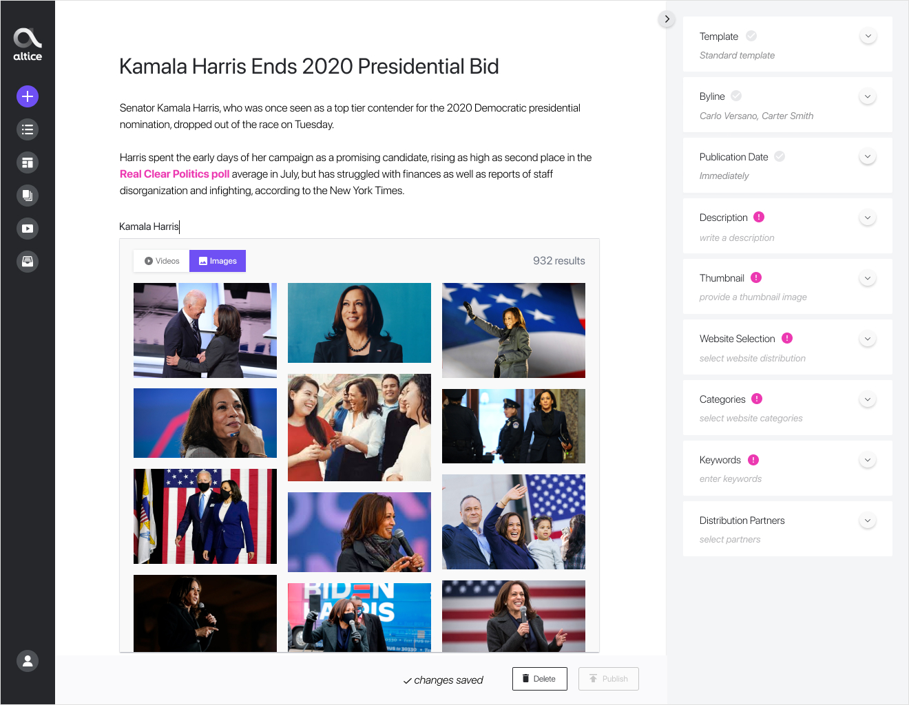
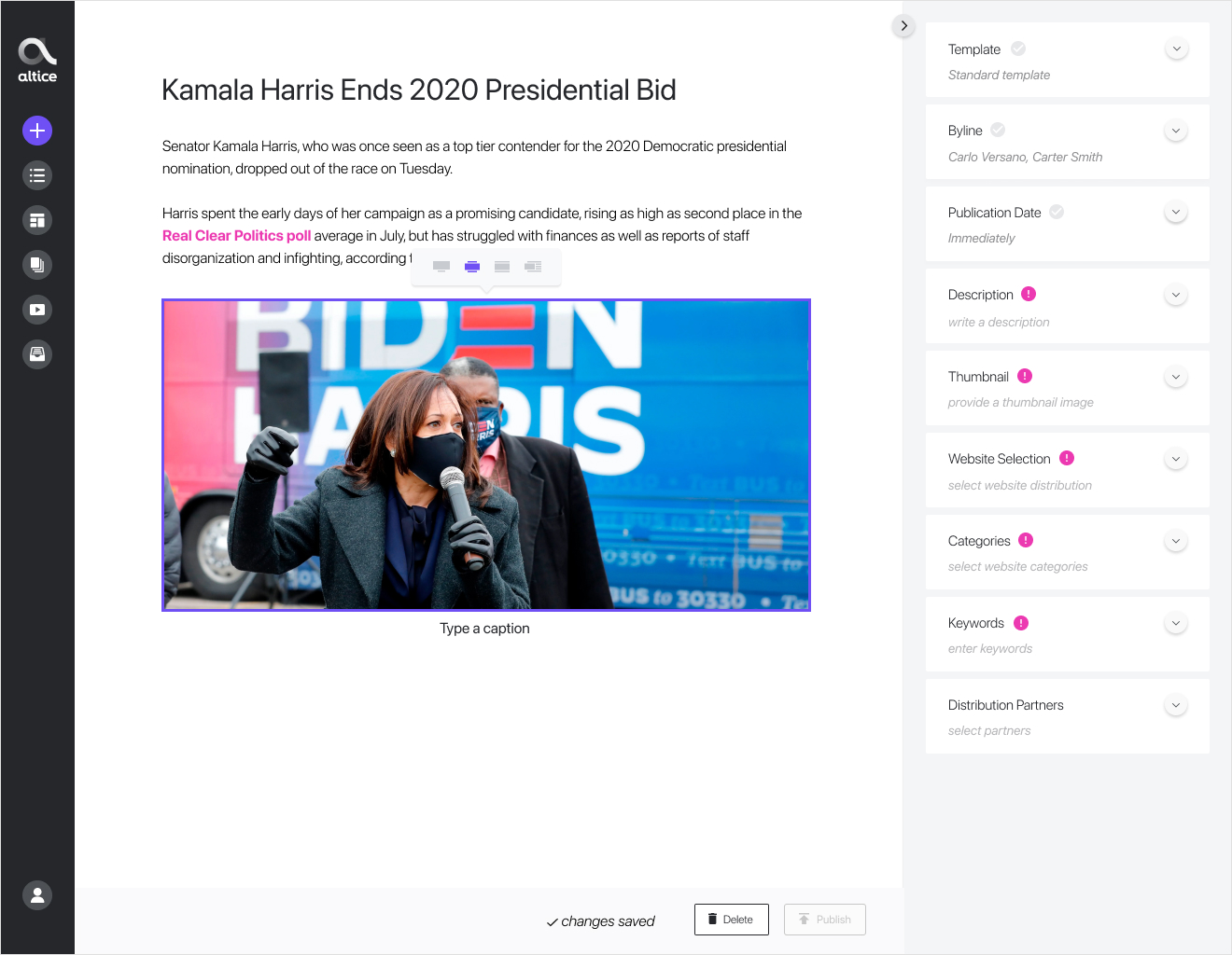
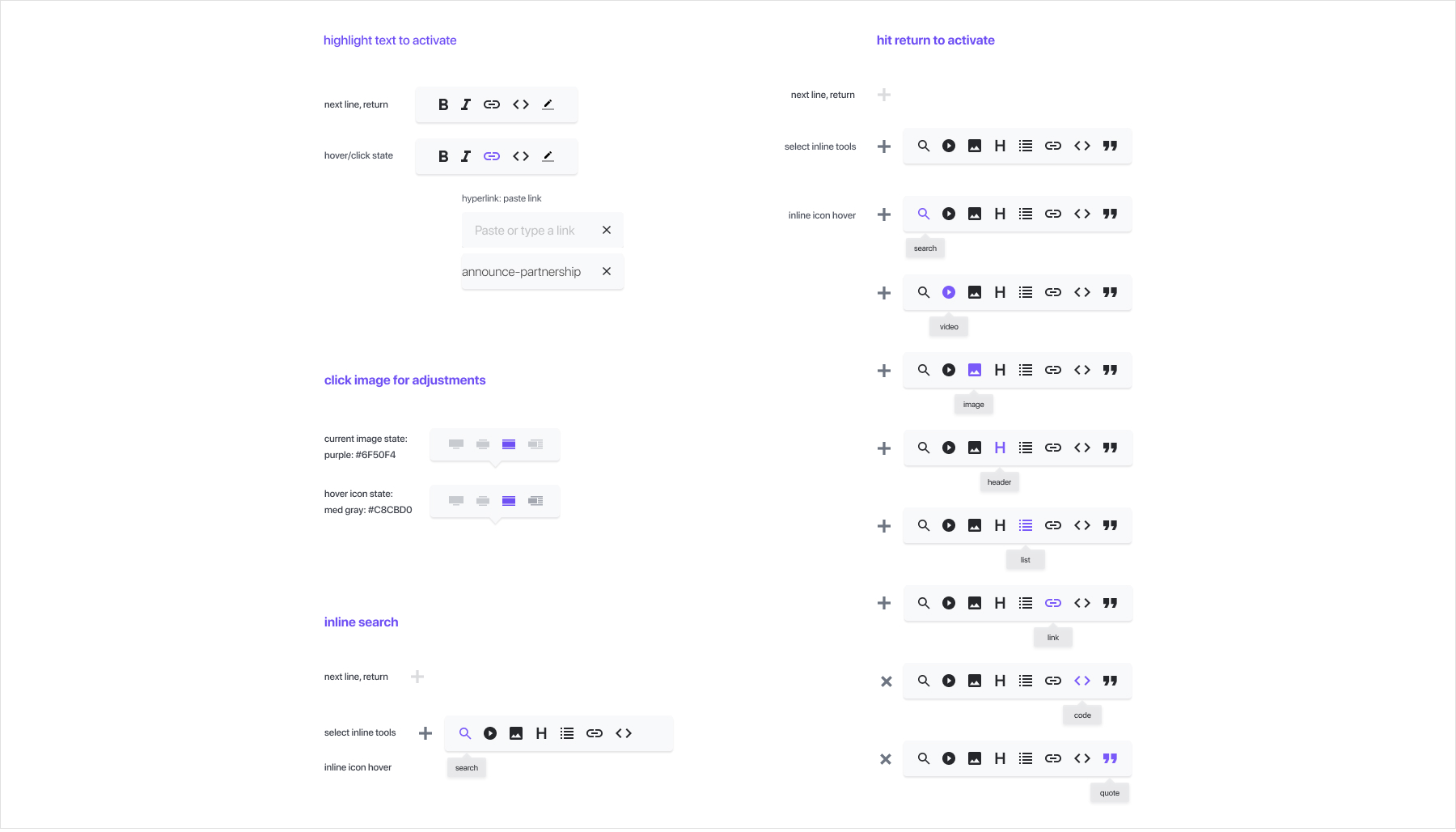
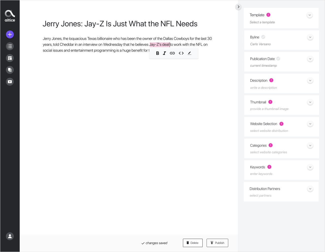
Inline Functionality
Inline functionality was essential for the storytelling workflow for several reasons. Below are a few takeaways we learned early on during the discovery phase of the project:
"Highlighting text, right-clicking to format it, gets annoying; the right-clicking is the annoying part, not the inline formatting" - Editor.
"Switching away to the Media Library to add a new image is disruptive, want everything inline and within the storytelling context" - Writer.
WYSIWYG, an acronym for What You See Is What You Get, is a system in which editing software allows content to be edited in a form that resembles its appearance when printed or displayed as a finished product, such as a printed document, web page, or slide presentation. In the context of the storytelling workflow we were building, a WYSIWYG. With this inline WYSIWYG functionality, a user would pull tweets, videos, links, or search for supplemental content all within a few clicks. It's also important to note that having this flexibility would help with recruitment - because if the storytelling tools are strong, it signals to potential employees that we're dedicated to making use of the best tools out there.
Now let's go over ideas we proposed for inline editing, template selection, metadata, and article preview.
Inline Functionality
Inline functionality was essential for the storytelling workflow for several reasons. Below are a few takeaways we learned early on during the discovery phase of the project:
"Highlighting text, right-clicking to format it, gets annoying; the right-clicking is the annoying part, not the inline formatting" - Editor.
"Switching away to the Media Library to add a new image is disruptive, want everything inline and within the storytelling context" - Writer.
WYSIWYG, an acronym for What You See Is What You Get, is a system in which editing software allows content to be edited in a form that resembles its appearance when printed or displayed as a finished product, such as a printed document, web page, or slide presentation. In the context of the storytelling workflow we were building, a WYSIWYG. With this inline WYSIWYG functionality, a user would pull tweets, videos, links, or search for supplemental content all within a few clicks. It's also important to note that having this flexibility would help with recruitment - because if the storytelling tools are strong, it signals to potential employees that we're dedicated to making use of the best tools out there.
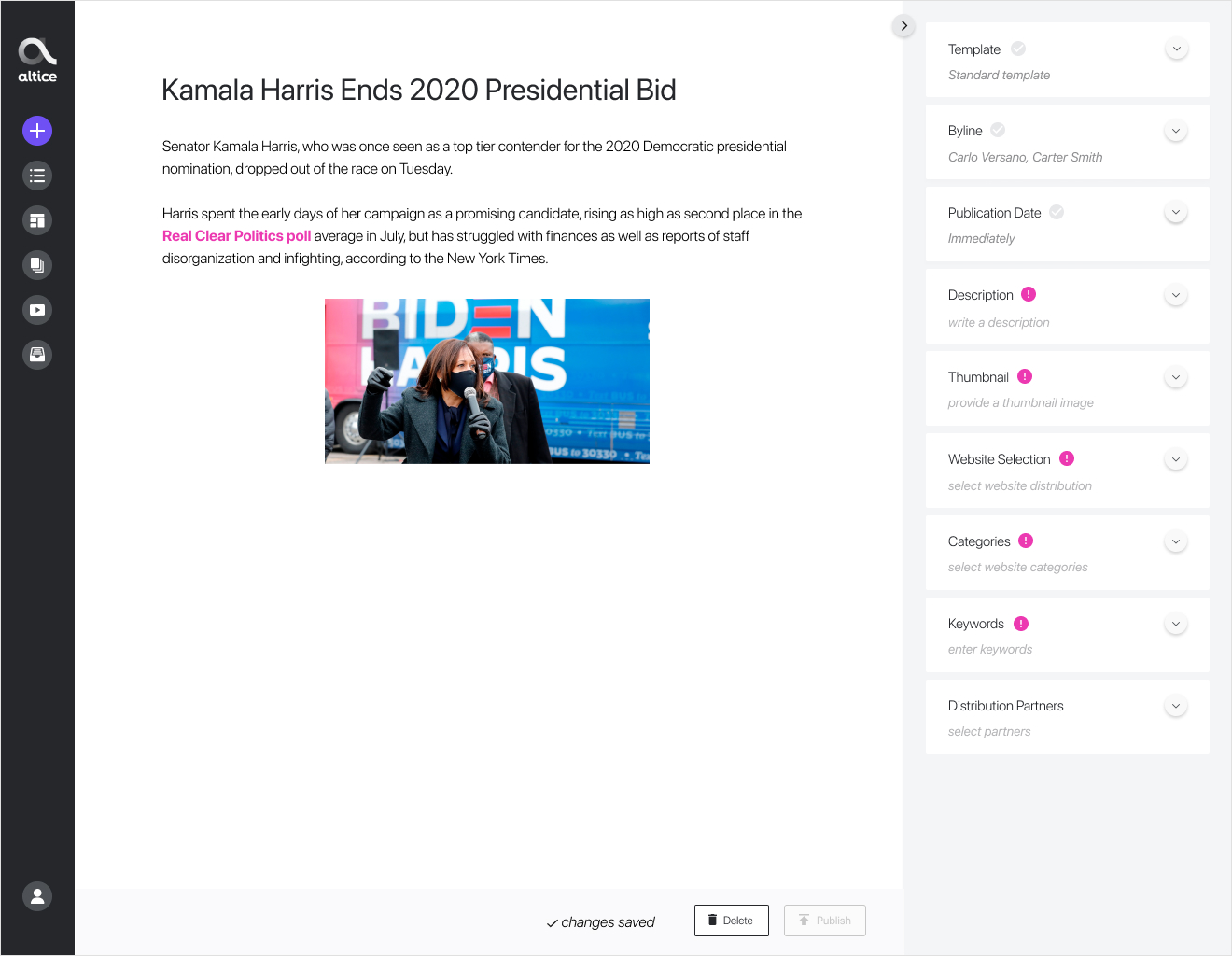
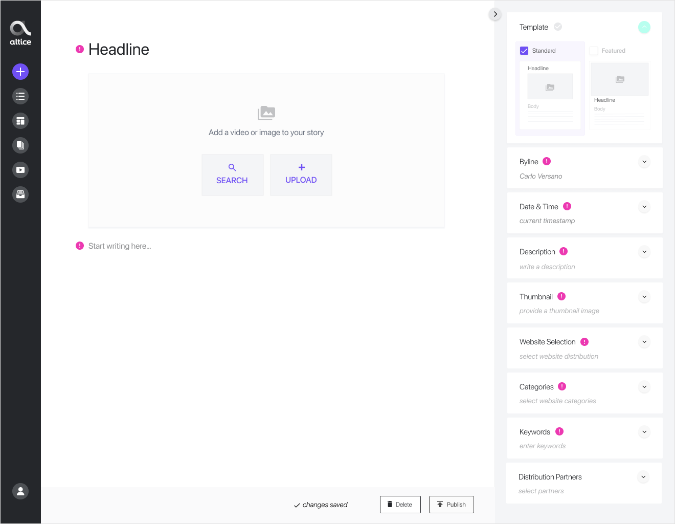
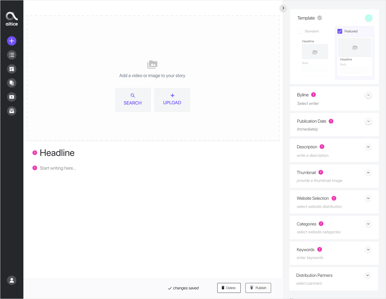
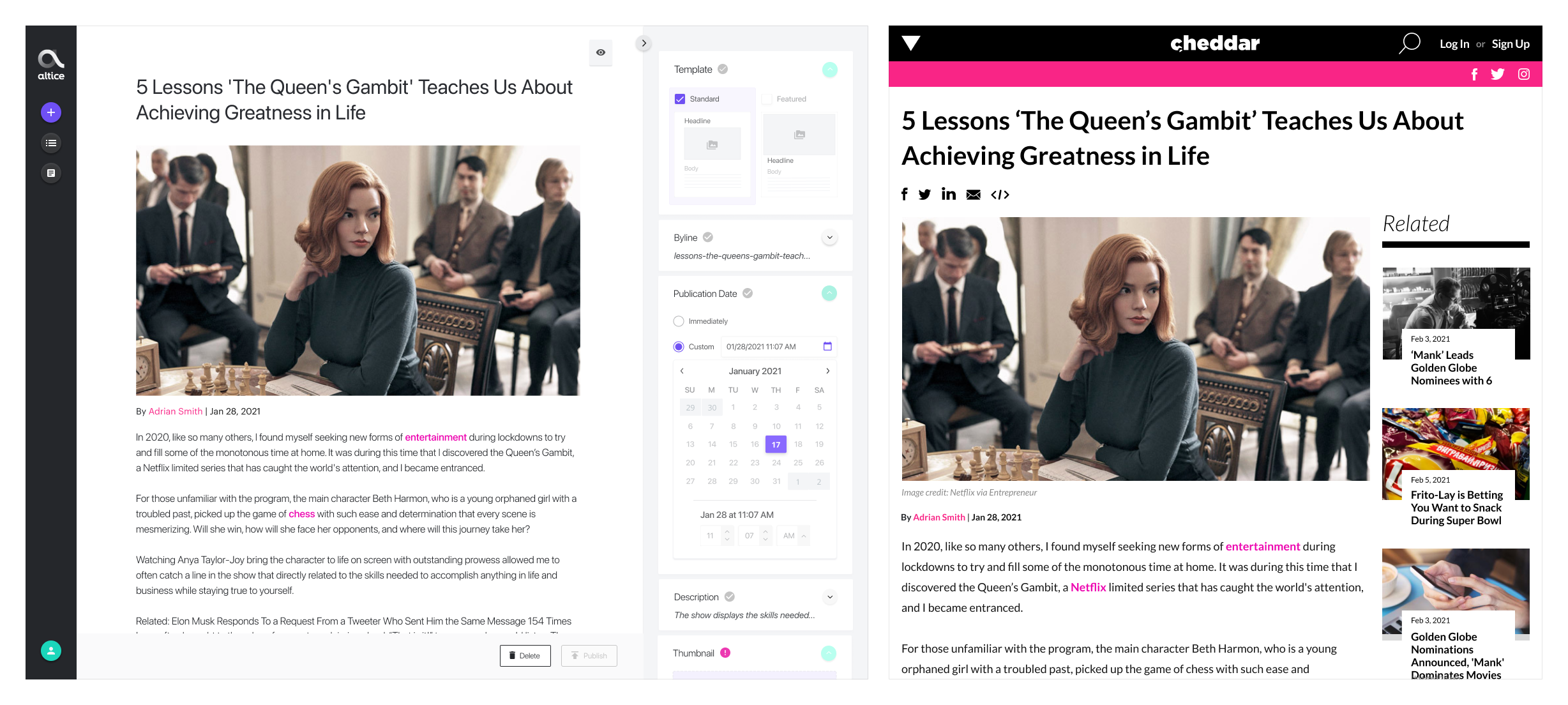
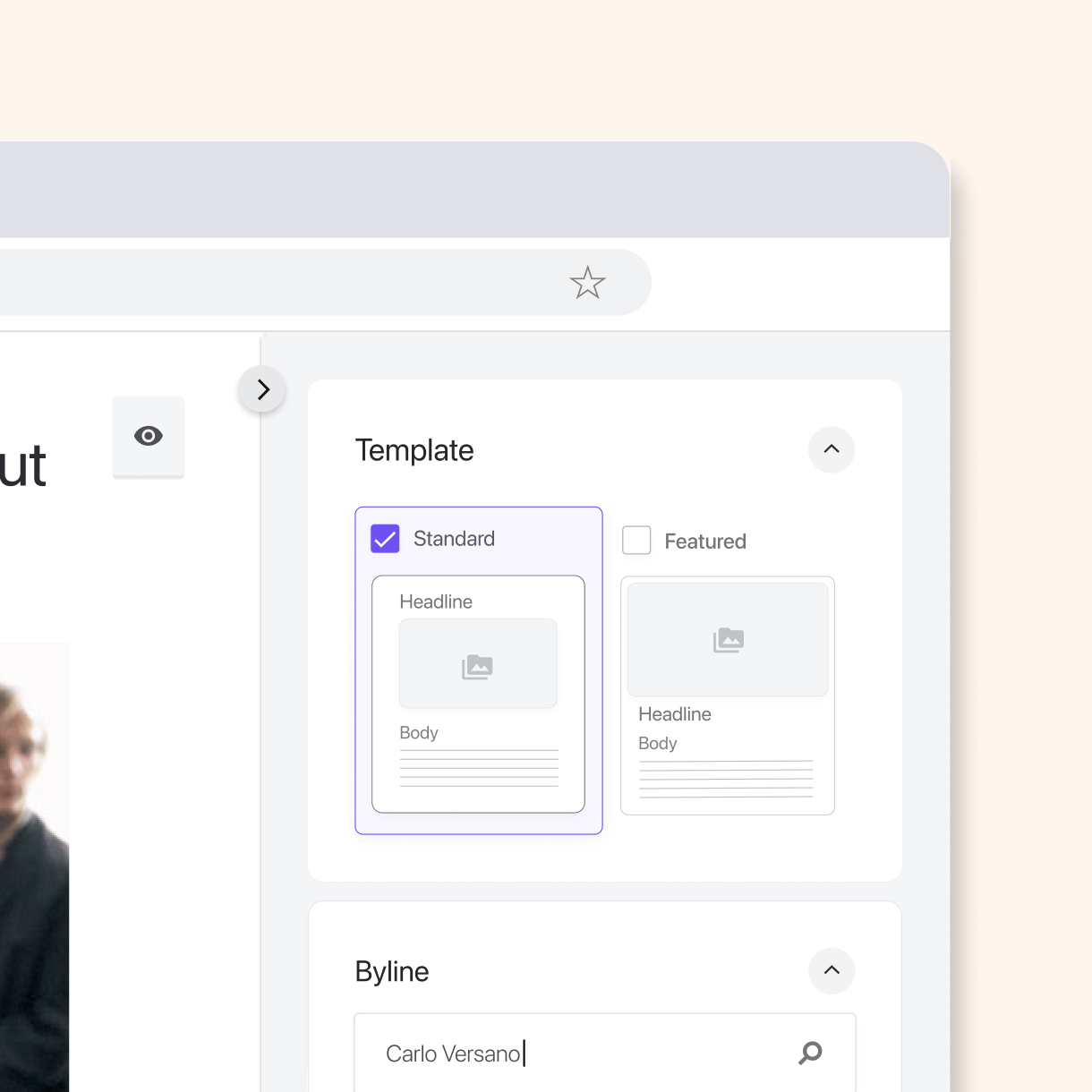
Story Templates
A CMS allows you to edit, modify, organize, delete, publish the website content with predefined templates. Our main goal was to design templates that supported interactivity and displayed content in a clean, modern format for dynamic storytelling. It was imperative that users could change the templates without disrupting the surrounding content. For example, if a user selected a different template while editing a story, the text, styling, etc., would transfer over without any changes to the content.
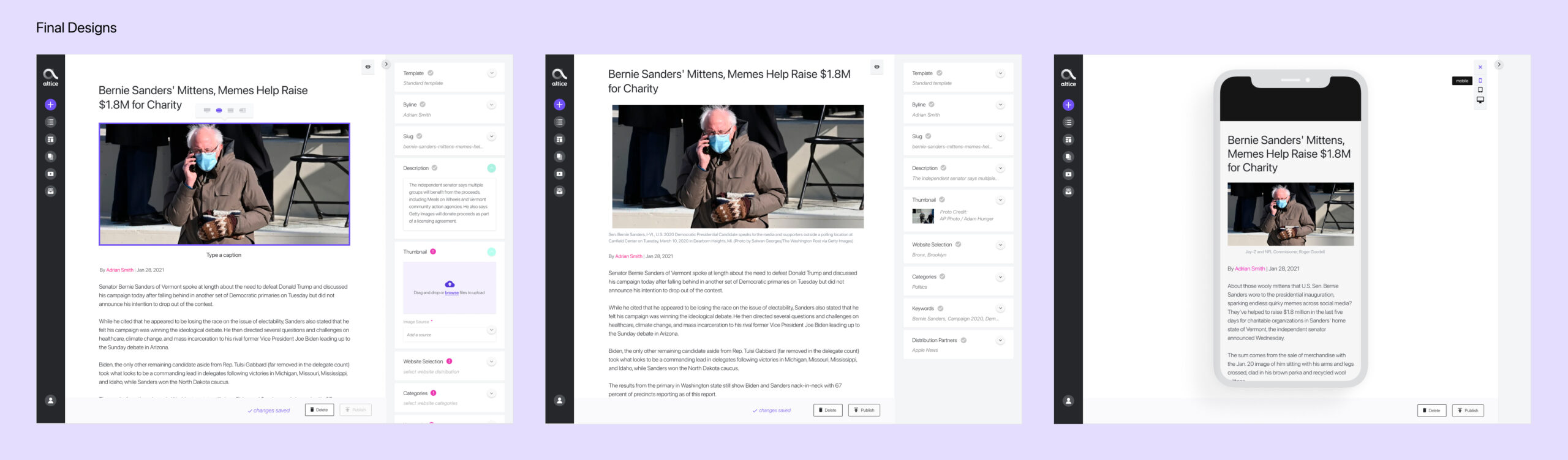
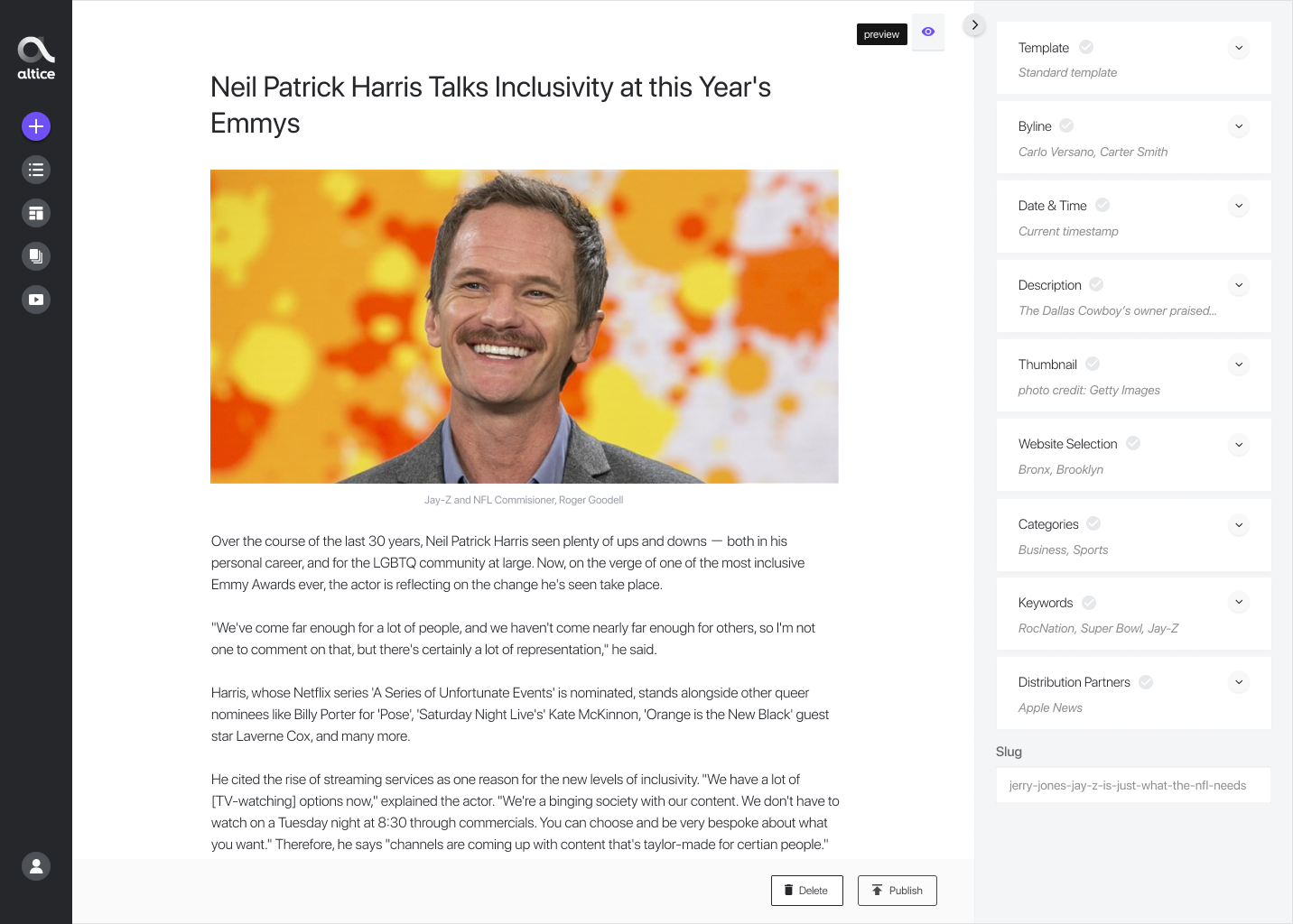
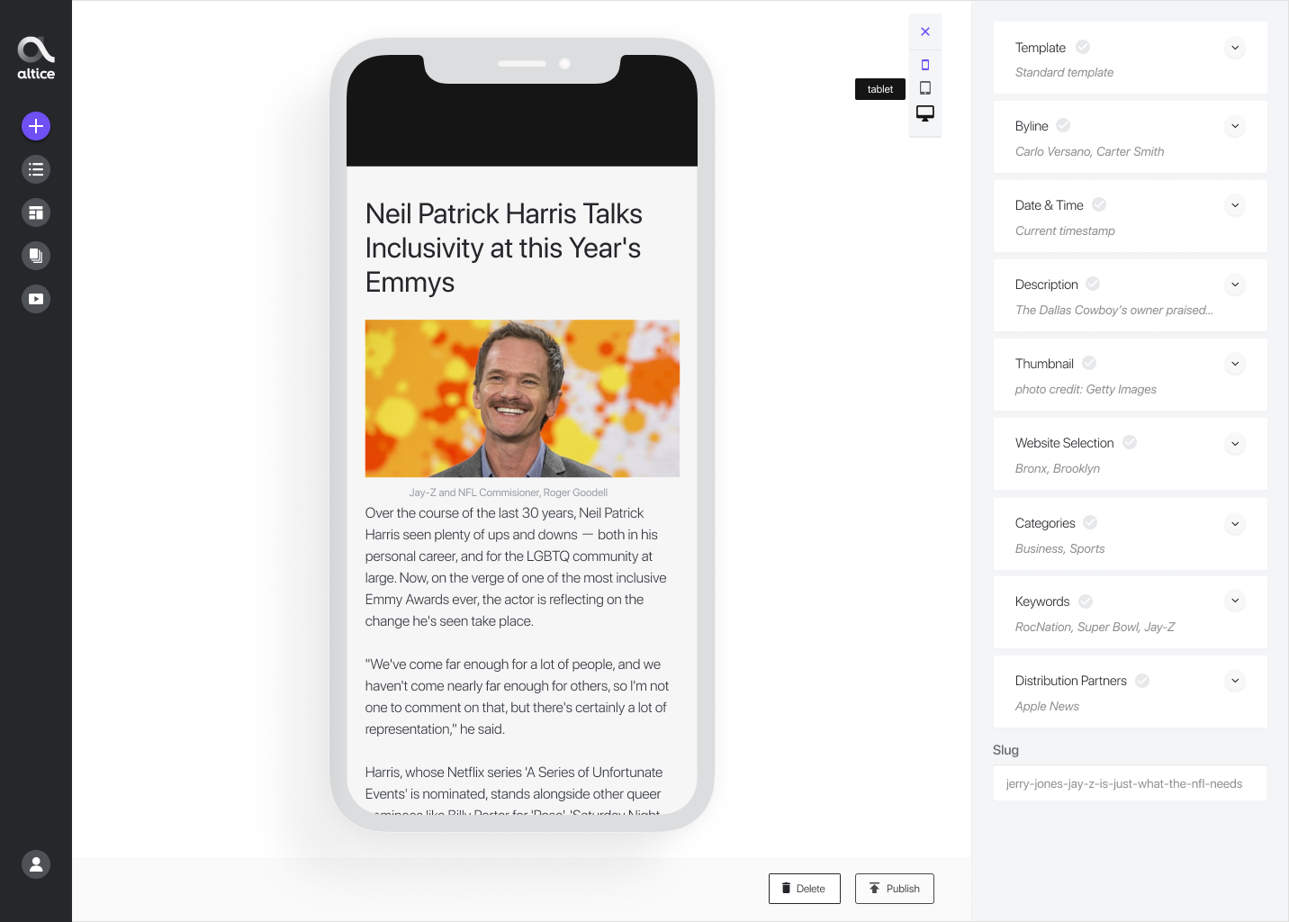
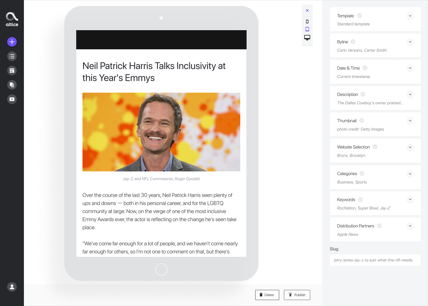
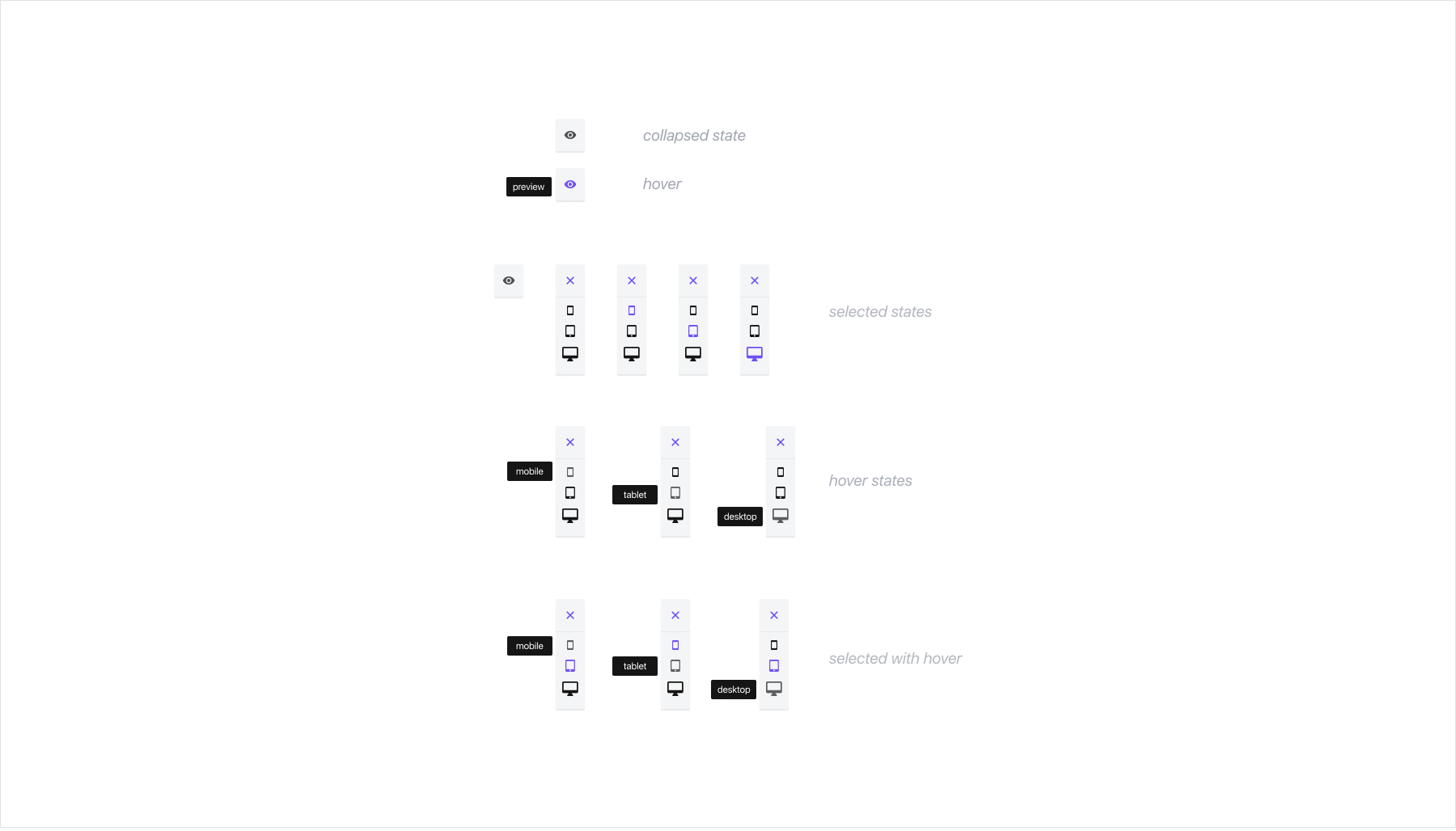
Story Preview
During the discovery phase, we learned that story preview was a must-have for the editorial teams. Previewing assets before publication reduced the errors and increased the confidence in the publishing process. Preview of the homepage or site sections had not been possible before, and we wanted to reduce errors on the page. To solve this problem, we decided that users should have the option to view the story on multiple devices as they create content. This functionality increases confidence for users because they can make "on the fly" changes and quickly publish work with reduced errors.

Right Side Tool Bar
A designated area where metadata is collected for storytelling/content creation
View user steps here
Right Side Tool Bar
A designated area where metadata is collected for storytelling/content creation
View user steps here
Right Side Tool Bar
A designated area where metadata is collected for storytelling/content creation
View user steps here
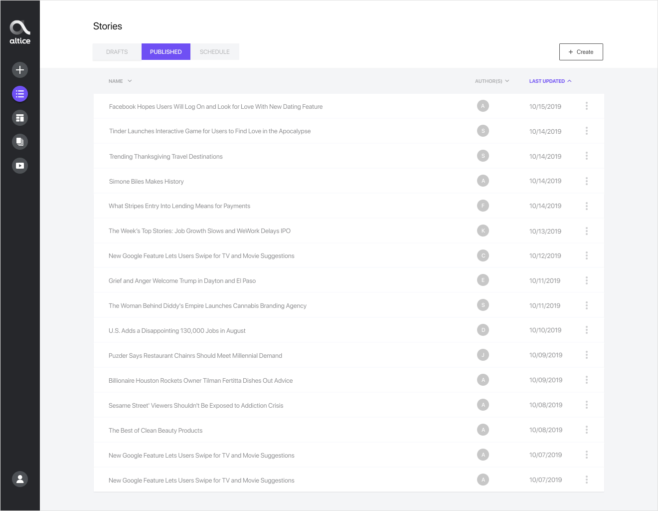
Results & Next Steps
The storytelling workflow has been widely accepted throughout the Altice organization. By introducing a more modern approach to writing, with the WYSIWYG editor's help, we have streamlined the workflows for both News12 and Cheddar editorial teams. The 3rd party CMS (Frankly) was roughly 50k per month, so we also reduced the organization's costs.
We've continued building out new features - such as tag management and a designated area for user and live stream settings.
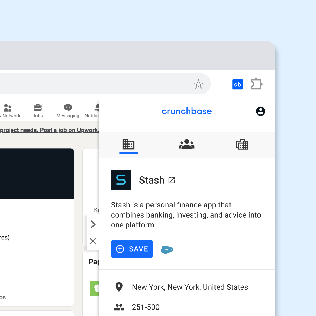
Selected Works

Crunchbase AI ProfilesProduct Design
Crunchbase SearchProduct Design
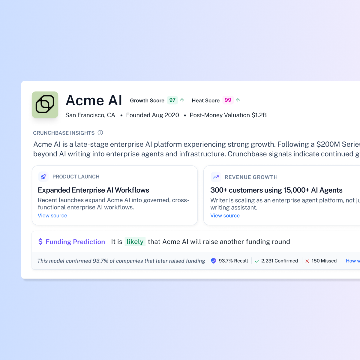
Crunchbase Prediction CredibilityProduct Design
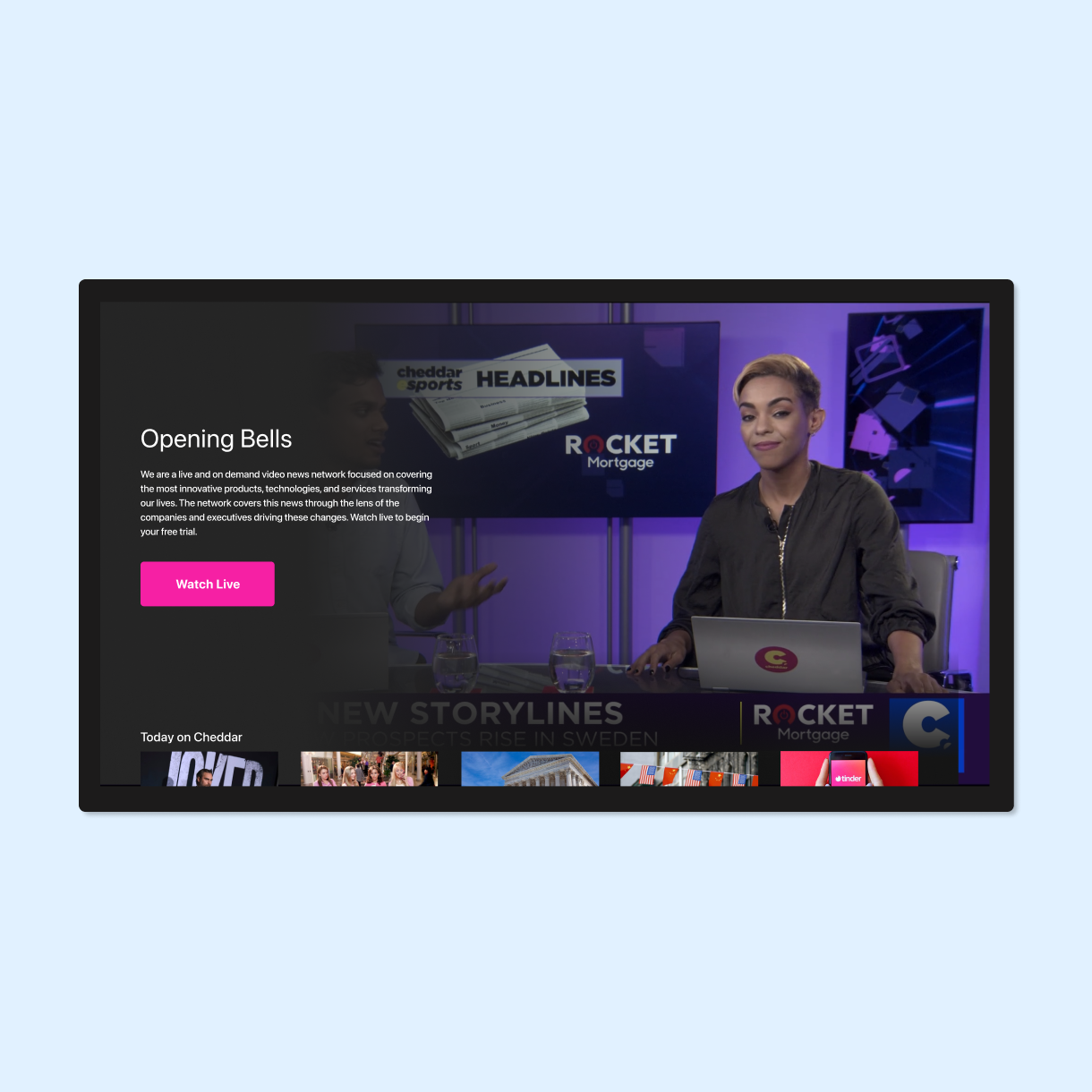
Cheddar + News12 CMSProduct Design
Pinterest Place PinsUI / UX
Crunchbase Chrome ExtensionProduct Design
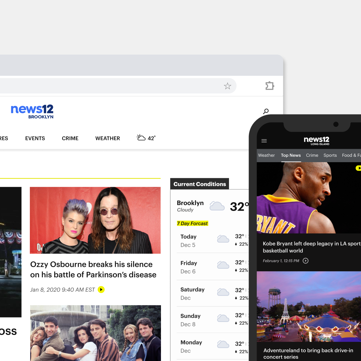
News12 Web & App ExperienceProduct Design
Audubon Climate ReportUI / UX
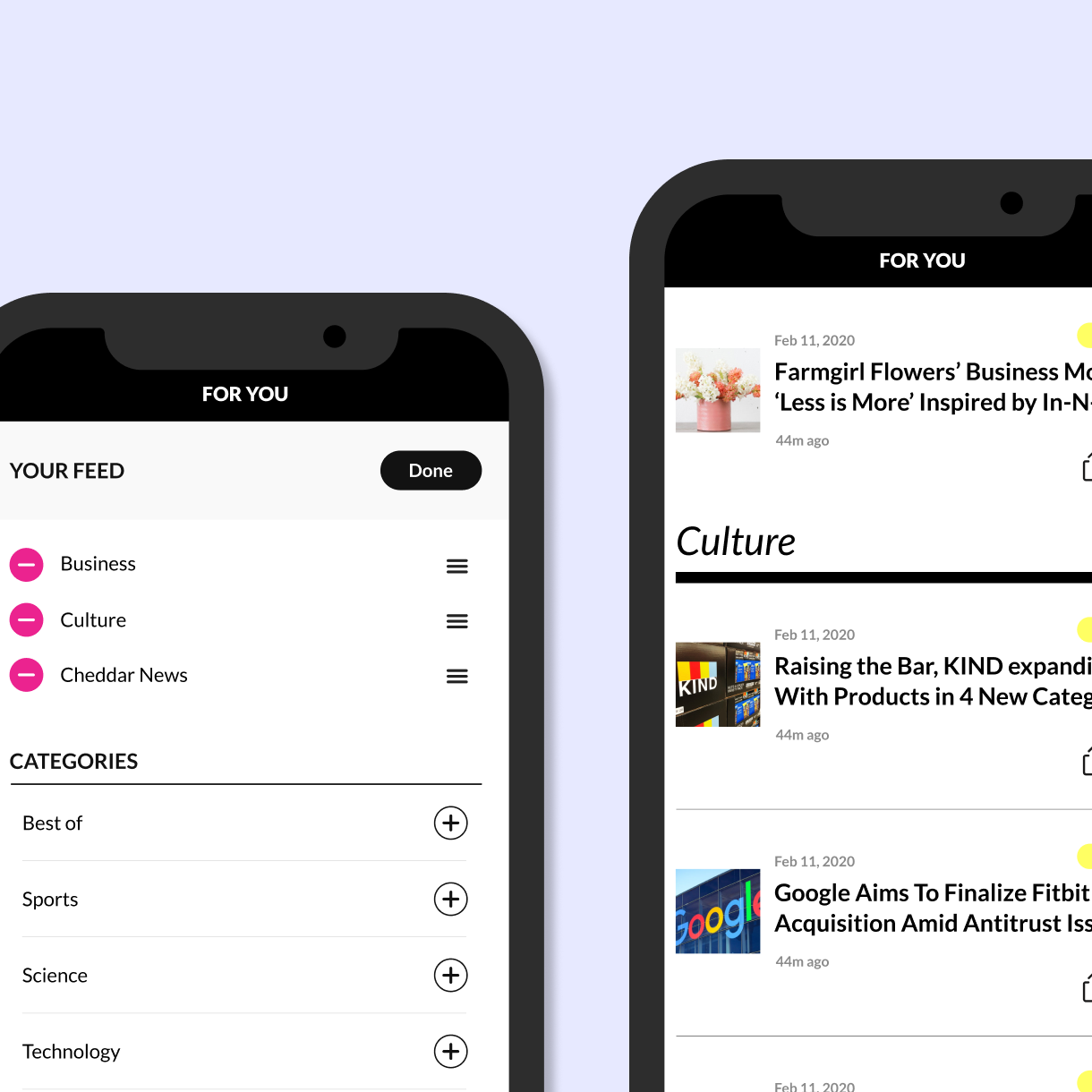
Cheddar Content PersonalizationProduct Design
Cheddar tvOS experienceProduct Design
Mapzen UI DesignUI Design
Body Metrics, Tech MuseumExperience Design
Little ShadowsMFA Design +Technology Thesis
DSI TableParsons
Midi TypewriterParsons MFA D+T
Algorithmic AnimationOpenframeworks

John WhitneyOpenframeworks
IllustrationProject type