
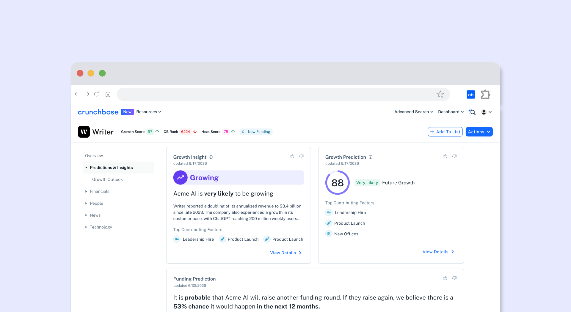
Crunchbase AI Company Profiles
Role: Lead Product Designer
I led the redesign from research through QA, partnering with Product, Engineering, Data Science, Product Marketing, Sales, and customer-facing teams. My work focused on introducing Predictions & Insights into the profile experience, redesigning the information architecture around user decision-making, and creating a foundation for post-launch improvements around financial context, monetization, and prediction trust.
Featured in the Wall Street Journal
"Can AI Predict the Next Big IPO? Crunchbase Thinks So"
By Belle Lin
Project overview & reframing the company profile experience
Crunchbase’s company profile has historically been one of the most important surfaces in the product. It is where users go to understand a company, validate an opportunity, and decide what to do next. As Crunchbase evolved from a company data provider into an AI-powered company intelligence platform, the profile became the foundation for that shift. The page could no longer simply organize facts about a company. It needed to help users understand what those facts meant, how a company was changing, and what might happen next.
A high-traffic surface with high-itent decisions
The company profile was not a low-stakes content page. It was one of Crunchbase's primary evaluation surfaces, where uses assessed companies, validated opportunities, and chose their next action.
11.4M desktop pageviews, 20.9M clicks on the profile, 47.8K unique users within a three-month period. And 39.6M pageviews over the following year. At this scale, every change to the profile expetrience had the potential to shape how users understood Crunchbase's new AI-powered intelligence layer.
Trusted data, manual synthesis
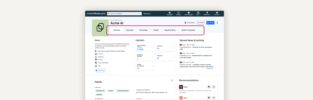
The previous profile gave users access to valuable company information, but the experience required them to connect the story themselves. Key signals were split across tabs, and users had to synthesize what the data meant.
Three main UX problems:
1. Fragmented IA: the tab model forced users to synthesize company signals across isolated destinations
2. Multiple workflows: investors, GTM teams, and founders each used the profile differently, but the old IA was organized around data types rather than decision paths.
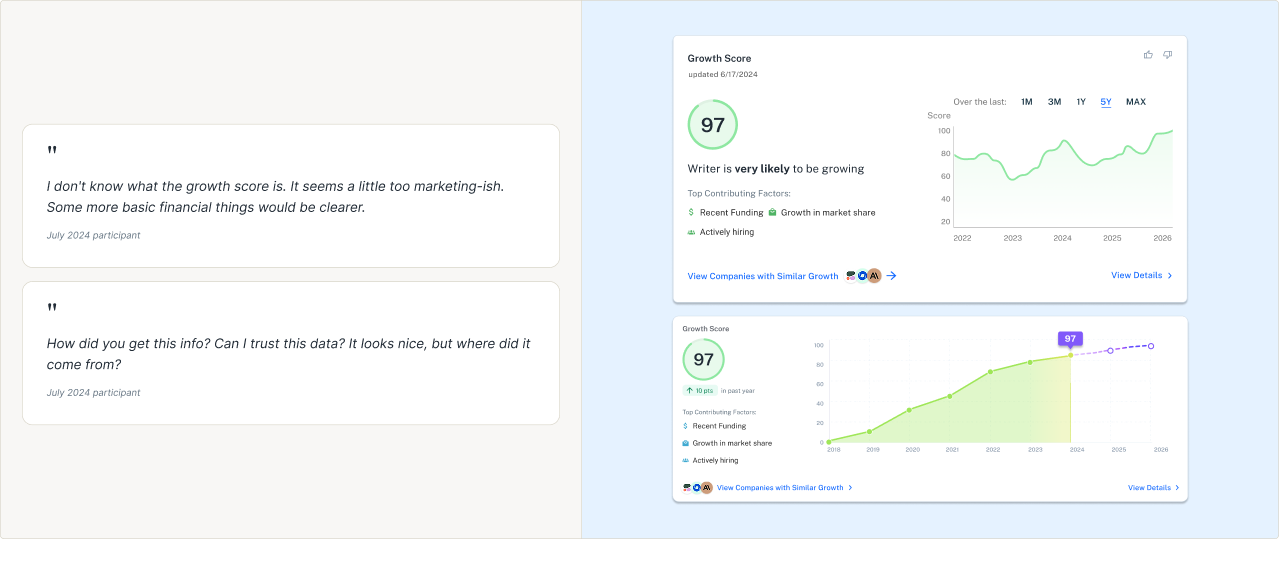
3. AI signals needed a trust foundation: users were interested, but only when they could understand what data supported the signal.
Design challenge: Design one profile experience that could support different evaluation workflows while making predictive signals feel credible.
A prediction alone was not enough
Research showed that users needed evidence before trusting AI-generated findings. They were asking how the signal was formed, what data supported it, and whether they could inspect the evidence before using it.
The common pattern was:
Prediction appears → reasoning is unclear → user returns to fundamentals
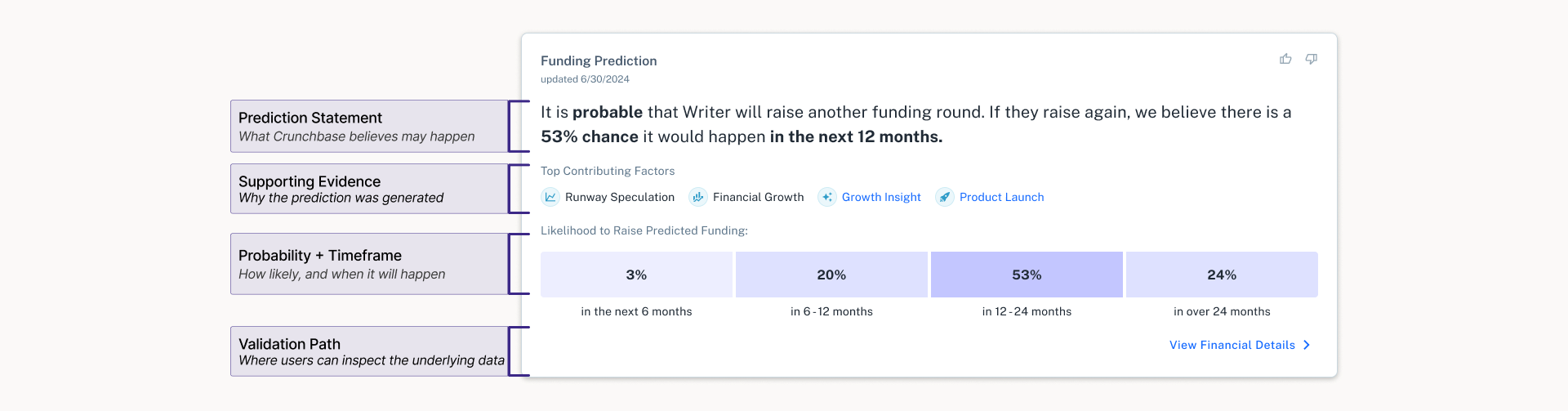
Why the Funding Prediction resonated with users:
Funding Prediction resonated because it paired a forward-looking claim with familiar financial context, visible contributing factors, probability, timing, and a path to inspect the underlying data. This made Funding Prediction a bridge between trusted historical data and new predictive intelligence.
Principles that guided decision-making
1. Organize the profile as a company story: what happened, what is happening now, and what might happen next.
2. Support multiple workflows from one surface: the page architecture needed to serve investors, founders, and GTM teams.
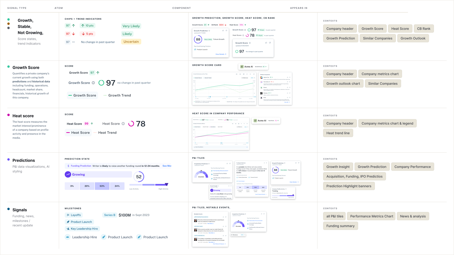
3. Create a repeatable system for new AI signals: prediction statement, contributing factors, timeframe, validation paths, and feedback inputs.
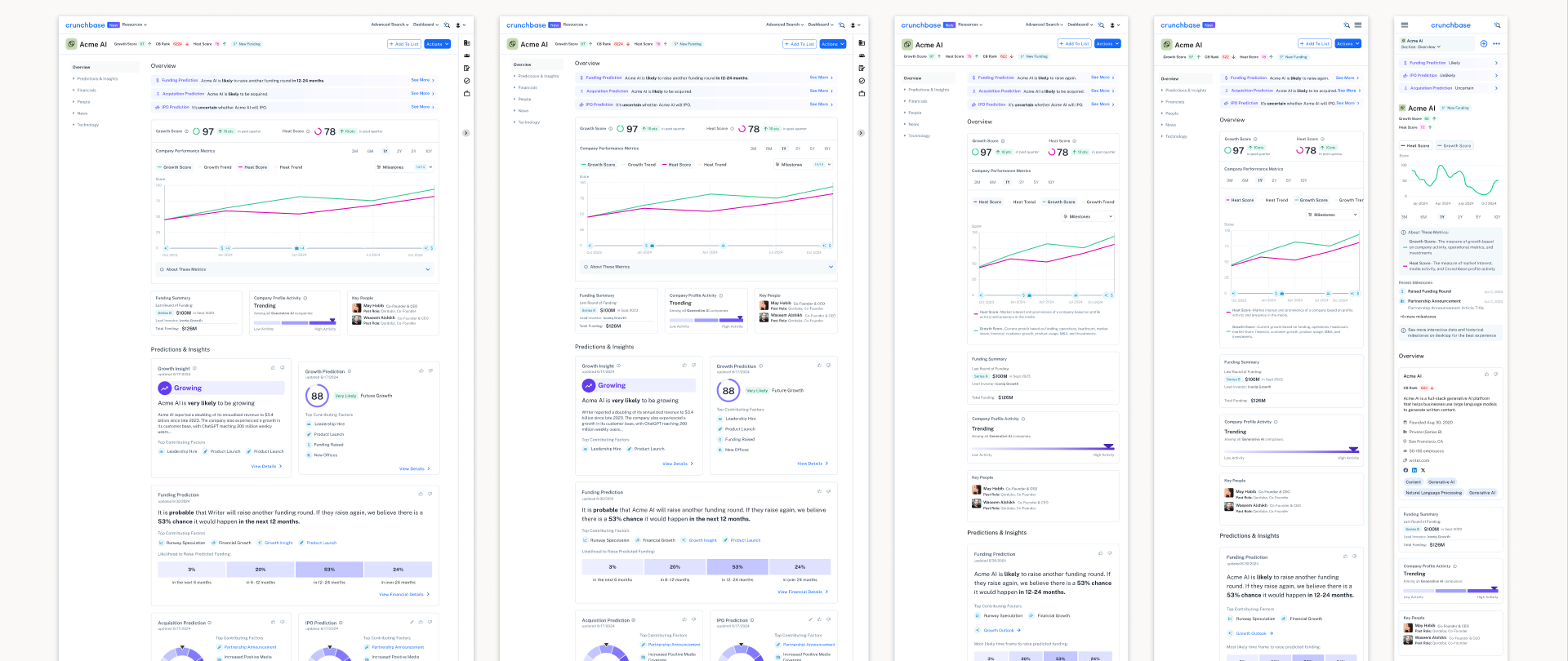
A single surface for historical, current, and future company signals
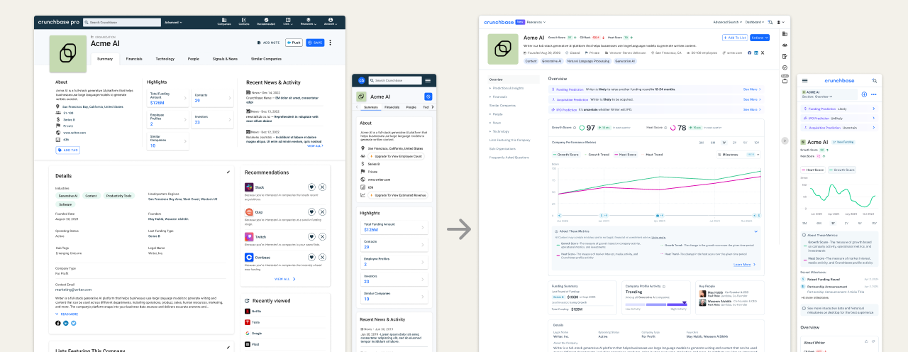
Crunchbase's company profile became the place where users could see where a company had been, where it was now, and where it was likely going. AI predictions were placed alongside familiar data so users weren't confronted with all new information at once. Research showed users needed that grounding before they would engage with forward-looking signals.
Key UX decisions that shaped the new experience
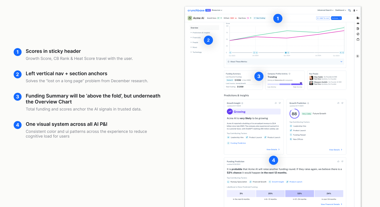
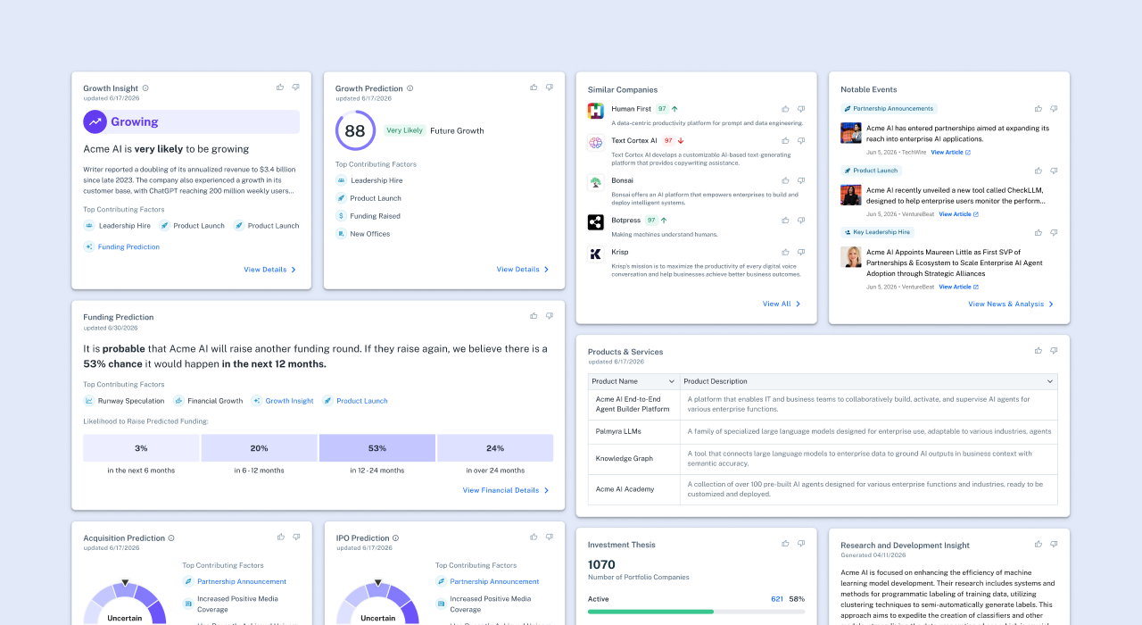
The new AI profile created a more opinionated structure around momentum, prediction, evidence, and market context. Scores in the sticky header traveled with the user. Left navigation helped users move through a long, data-rich page without losing context. Funding Summary stayed near the Overview chart. Consistent P&I patterns reduced cognitive load.
From tabs to a profile landing page
The new experience also moved the profile from a tabbed experience to a landing page model. Instead of forcing users to leave context to find different types of data, the new IA created a single scrollable page with vertical navigation, section anchors, and detail paths. This helped users move between Overview, Predictions & Insights, Financials, Market Intelligence, People, News, and Technology without restarting their evaluation.
A repeatable system for new AI signals
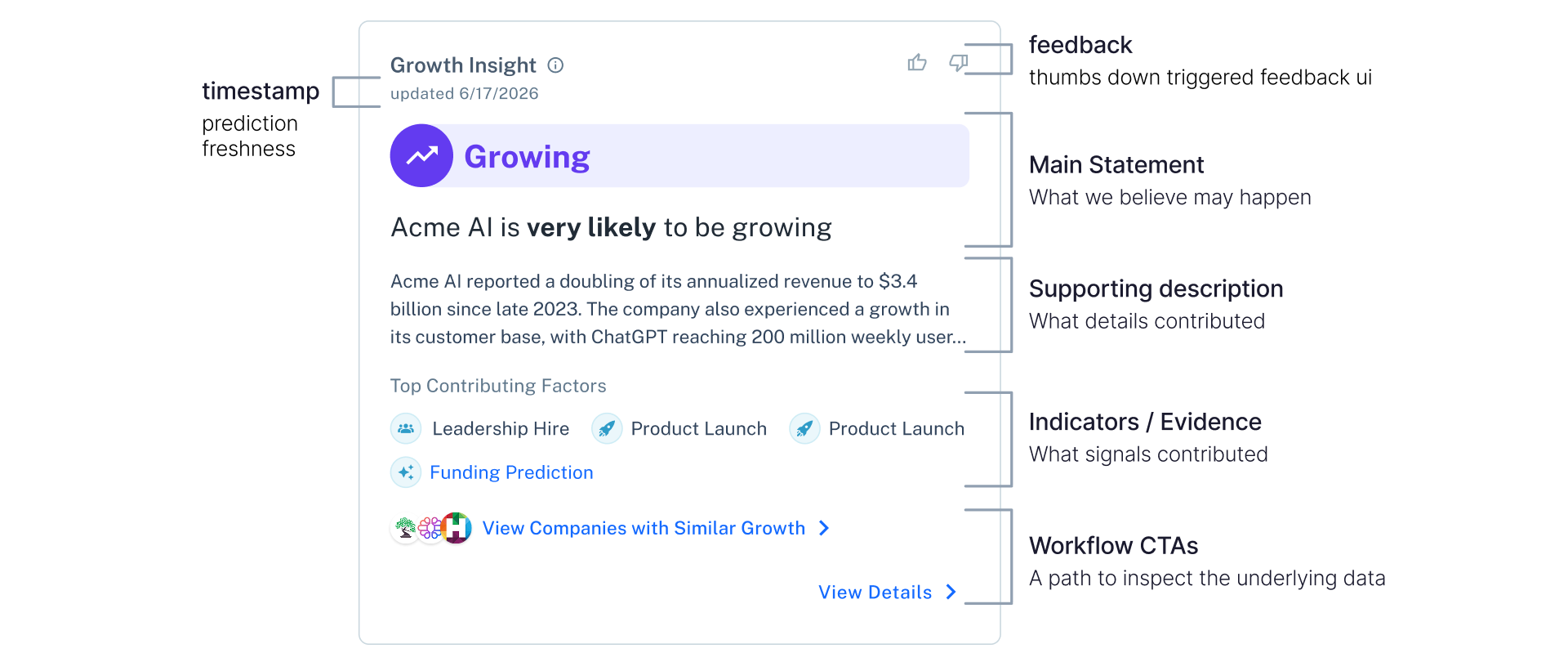
Predictions & Insights needed a consistent structure so users could understand unfamiliar AI-powered signals. Each P&I tile follows the same anatomy in the same order — date, feedback input, prediction statement, probability and timeframe, contributing factors, and validation path CTAs — so users learn the pattern once and can read any prediction or insight across the product.
Launch impact
The new company profile experience launched in February 2025 and created immediate engagement with Predictions & Insights.
~9,000 P&I upsell clicks in Week 1
~208 trial starts in Week 1
~$13K estimated net-new ARR from Week 1 trial starts
Building through iteration
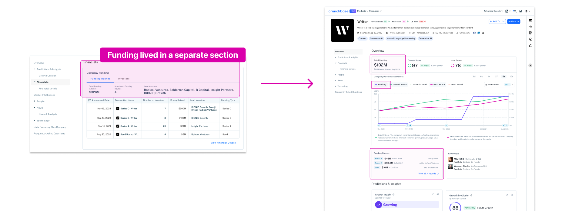
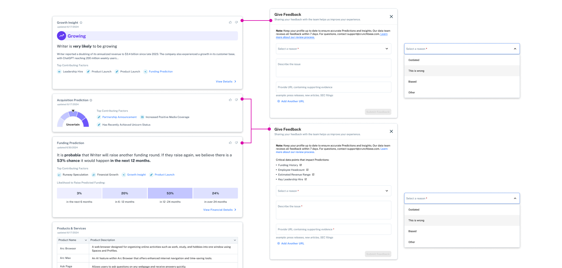
After launch, the team continued improving the experience. Financial data moved into the Overview section, feedback modals were refined to capture more specific user input, and upsell patterns were updated based on engagement data.
Reflection
This project clarified something important about designing AI-powered products. Users do not engage with predictions simply because they are well explained. They engage when those predictions are grounded in data they already understand and trust. Building confidence in forward-looking signals takes time and continued iteration. Some of the most impactful improvements came after launch, when research revealed opportunities to go beyond explaining individual predictions and help users understand the accuracy of the model behind them.
Continue reading → Building trust in AI Predictions & Insights
Selected Works

Crunchbase AI ProfilesProduct Design
Crunchbase SearchProduct Design
Crunchbase Prediction CredibilityProduct Design
Cheddar + News12 CMSProduct Design
Pinterest Place PinsUI / UX
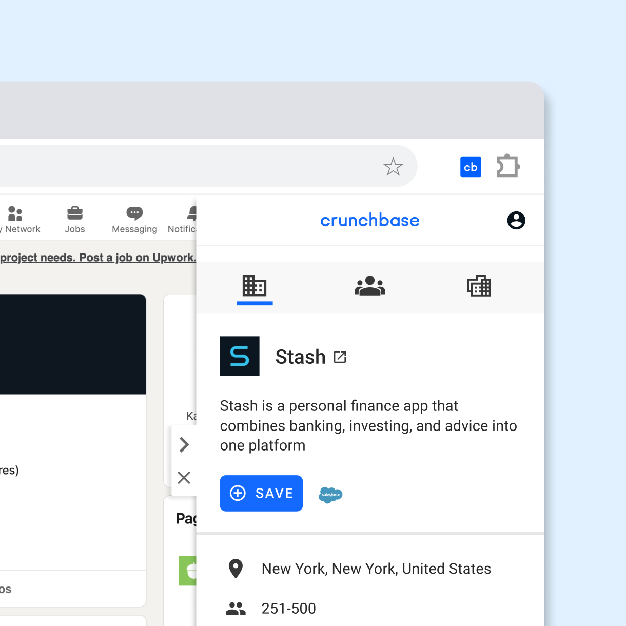
Crunchbase Chrome ExtensionProduct Design
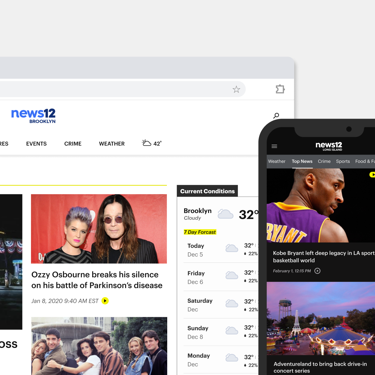
News12 Web & App ExperienceProduct Design
Audubon Climate ReportUI / UX
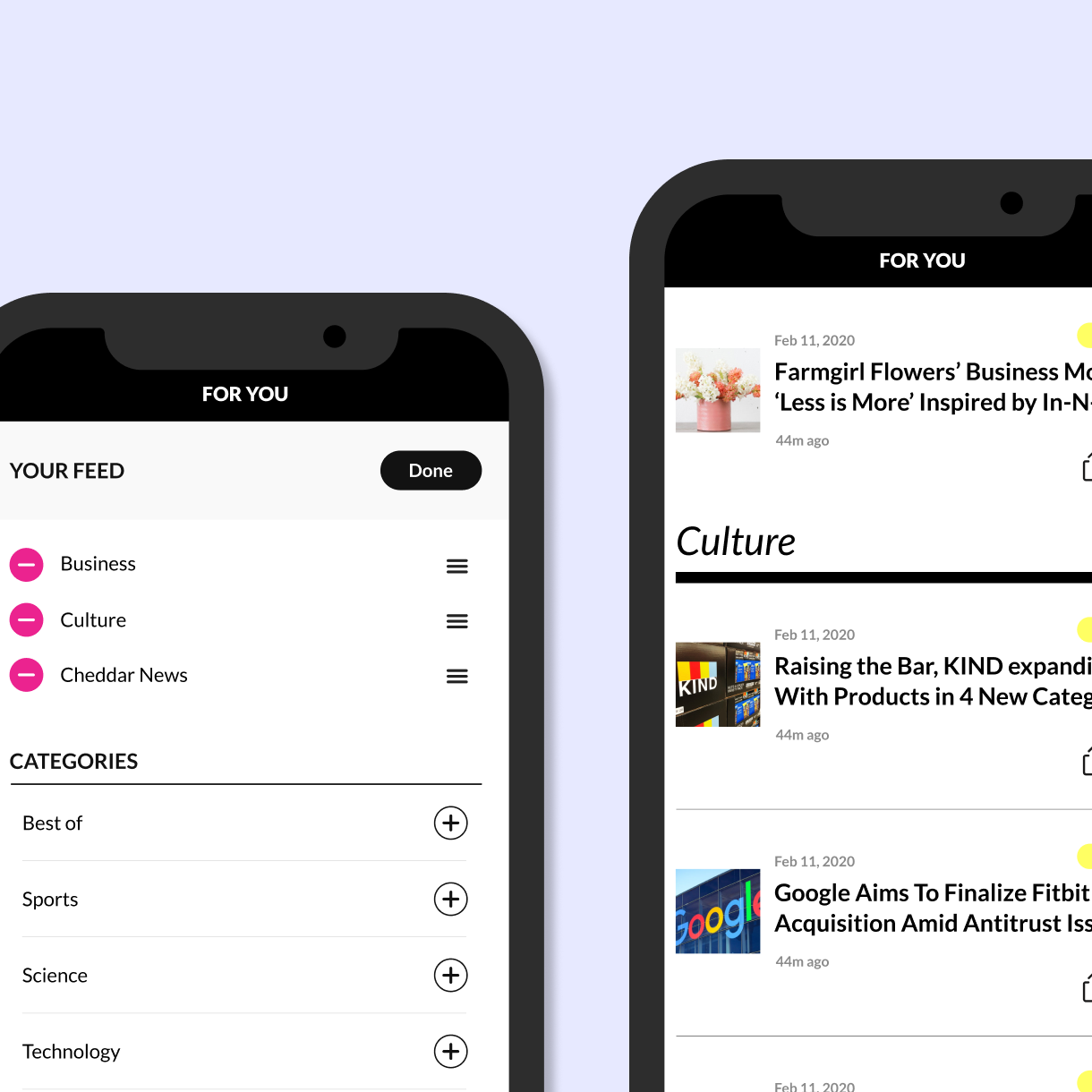
Cheddar Content PersonalizationProduct Design
Cheddar tvOS experienceProduct Design
Body Metrics, Tech MuseumExperience Design
Little ShadowsMFA Design +Technology Thesis
DSI TableParsons
Midi TypewriterParsons MFA D+T
Algorithmic AnimationOpenframeworks

John WhitneyOpenframeworks
IllustrationProject type